tom lever blog

30 April 2018

The 'Craven Calculation' - DT06

Our sixth D&T was a presentation by one of the PDE tutors, Ben Craven, who is a fascinating personality. His talk focused on the benefits and the necessity of making quick calculations- often considering energy usage. For example, we worked out the inefficiencies of powering the GSofA Reid Building with water caught on the roof though various very rough approximations. Ben's blog Is a wonderful collection of such thought experiments.

It is very important in most projects to very early get a handle on engineering realities, these can be done as rough as necessary and are a very good way of whittling down silly ideas after the initial 'blue sky thinking' stages.

We are now tasked with coming up with our own 'Craven Calculations'. For mine I was inspired by a quote from B is for Bauhaus by Deyan Sujic, commenting on the amount of waste that our Phones save us from.


My first step was to find out the carbon footprint of one iPhone. This turns out to be, in the case of my iPhone 6, a whopping 95 kg of CO2. Most of which comes from the production process.


95 kg seems like a lot. Especially of CO2, which is a gas. At an atmospheric density of 1.225 kg/m3, that's 77m3, or 5% of a swimming pool. When you picture that as 'smoke' though it doesn't actually seem so bad.

When we consider however, what the Phone replaces, we see that we are quite well off really. Looking at the storage data for my iPhone; which is, naturally, full to the brim, we see there is a lot being stored.


6.13 GB of Photos, at 1.5MB a photo on average, is about 4,000 individual photographs. I'm not sure how I have 877MB of messages, but if we class this as 'multimedia' and compare it to a 56 page multimedia PDF of 5MB,


It works out at 0.1MP/page, effectively meaning that I have 8,770 pages of messages. If each page weighs 5g, then that's 44kg of messages I would have to carry around.

I also have 27MB of email. 


Compared to a plain text document, 3 pages at 100Kb, this works out as 0.03MB a page: 900 pages and 4.5kg of paper i'm sure the postman wouldn't want to deliver. 

Tallying up all of these sources of data storage, we get some very interesting results.


The results show that we have saved ourselves from 26,343 pages of paper. Apparently, the carbon footprint of 100,000 sheets is equivalent to 6,000kg of CO2, which works out as 0.06kg a sheet, and  a footprint of 1,581kg of CO2, or 3.44 swimming pools. Massive compared to the impact of one iPhone, in fact, equivalent to 16.64 iPhones.

Interestingly, I have 2GB of music on my phone, equivalent to 2.8 CD's, or at 250 individual songs, 31 vinyl records. This is a major source of data usage, but not actually that much in terms of carbon contribution when compared to the replaced paper figure. This is because a large amount of music (and video, of which I have none stored as hard data) can now be very easily streamed. This, the entire internet, and my mapping data, which is downloaded on-the-fly, points to the fact that my phone actually replaces even more physical material than may seem at first glance.

I think we should be very grateful of our phones and the functionality that they give us, especially as it is a new paradigm which has completely changed the way we live and socialise. I am not suggesting that we would have used this much paper if we didn't have phones, we would have simply done a lot less. Perhaps other revolutions in technology will actually massively enhance our capabilities while silently removing sources of emissions and energy usage.

We should also be very grateful of our ability to do these back-of-the-fag packet calculations, and incorporate them into our design processes as early as possible. Speed often beats precision, although there will be time for that later on in projects I'm sure.


29 April 2018

Housing - The Global Situation - DT0C


I began this project by closely surveying a few local developments which look to reimagine housing with a new vision of the future, but the basis of this research as a look into housing for the ninety percent i.e., most of the human population, should really survey the isssue on a global basis. This is the aim of this post.

Clearly, the world population in general is heading towards increasing urbanisation. An idea so established it requires no introduction is that as countries become 'more developed' (i.e. climb up the HDI rankings) is that they urbanise their populations and begin more advanced forms of economic production such as manufacturing and service provision. This project, started in England as the industrial revolution, is pretty much complete in the developed world. As shown by the following, the world as a whole however is still in the process of increasing the urbanisation of it's citizens.


The majority of this growth is going to come from developing nations, which, I presume, are competently emancipating people from sustenance farming and developing their own forms of global economic productivity.

One interesting thing to look at is the projected biggest cities by 2030, but what may be more interesting is how many of the worlds biggest cities are already from less-developed nations. This fact is only going to increase. New York, the developed west's only representative, is ready and waiting to be replaced by new, growing and ambitious settlements in the global south and east.


Clearly then, there is a growing phenomenon of urban growth in developing countries, and the 'east' in general is supplying this growth more than any other global region.


Our focus on 'the 90%' suggests we should focus on the majority of people, which means it is vital to observe this phenomenon and ask how should (or will) these people be housed?


One interesting method of discussion comes from a video titled 'Urban Geography: Why We Live Where We Do'. Which compares the growth model of European cities compared to that of American cities.


The core findings from this video can be summarised in the below chart, but the message is clear, the ancient cities of Europe have been established in a very different way from that of American cities.


The next image is a very telling one, which compares the average income of various parts of a European city with that of an American one.

Philadelphia vs Paris, comparison of income and area. Green = higher income.

The 'old world' model seems to be as follows: cities were established when walking was the primary mode of transport. Therefore, the rich are at an advantage when they live as close to the economic centre as possible. High end housing then situates itself in the centre, gradually yielding to big commercial business, but on the whole delivering quite posh central housing, and as commoners and immigrants come in from the outside world, they are situated on the outer fringes of the city.

The new world model is different. As they were starting to grow in the late 19th century; just as trains and trams, and later, cars were becoming the general mode of transport, the well-to-do placed themselves in the greenery of the country and commuted long but easy distances to work. As immigrants came from the old world and from the developing world, they filled the inner-city, gradually graduating to, and filling out, the rest of the urban area with automobile based suburbia.

These models offer extreme sides to an argument on how urban development may progress in the rest of the world. I, myself am a proponent of the walkable 'old-world' way of thinking, and, living in Glasgow these last couple of years, have greatly benefited from a dense, walkable urban core free from much obstruction from urban traffic, and is very safe compared to Glasgow's hard-edged reputation.


The developing world situation however does not fit these models for development exactly, and perhaps represents a third way. The developing world generally already hosts cities with high population and 'natural' geographic settlements like Europe does, but has embarked upon a new period of population growth in the last half-of-a-century. This means its cities are squeezed and forced to come up with ways of housing a new growth and influx of urban dwellers. 

While the old-world/ new-world question is not directly applicable, it offers us some extremes that may tease out some results when faced with the new housing question. Will (or is) Dehli settling it's new entrants in the suburban fringe, with a fresh Toyota Camry, or is it signing them up for a yearly Oyster card? By picking through some of the findings of the American/European problem, we can begin to formulate some findings.


Density is the defining characteristic of a city's urban fabric


One clear difference between America and Europe is the density of it's settlements. While Manhattan, and maybe Chicago, and maybe San Francisco, have what appear to be dense urban cores, these, and in every other case more-so, quickly descend into suburban sprawl.

Europe, however built up quite dense settlements, exemplified by the arrondissements of Paris, containing walkable neighbourhoods with mixed usage and flat but consistent and sustained density. Perfect. This is a very western-centric view of the extremes however, and comparing population density on a global scale, we learn a different lesson.


And, removing india just so we can actually see the rest of the data;


So most of the countries in the developing world, especially India, are already densely packed, and definitely more than the 'new world' example of Argentina, Mexico and the USA. Another finding is that the most densely populated regions today have also been the most densely populated regions throughout modern history. Which leads us to believe there may be something macro-culturally, or at least geographically, about why these regions hold such high urban densities. The top charts for urban density by city are as follows:


There is a mixture of interesting Asian cities and never-heard-of European towns here, which may be a result of favourable metropolitan area definitions, but the message is clear. Developing nations, and in particular India, are not waiting for skyscrapers to be built, they already have a dense urban fabric. This leads to some interesting examples of urbanism that may surprise the western world at first glance:

A post shared by ESTHETACORP (@esthetacorp) on 

Ho Chi Minh City, Vietnam


A post shared by ESTHETACORP (@esthetacorp) on 

Kottayam, Kerala, India


A post shared by ESTHETACORP (@esthetacorp) on 

Ernakulam, Kerala, India


A post shared by ESTHETACORP (@esthetacorp) on


Delhi, India


As I have already said, and as the images show, developing countries are fully behind urbanism and have all the resources available, without the need to complicate their massive programme with 'architecture' This leads me to the next point:

Developing countries are building their cities with the benefit of already-available technologies.


One defining feature of the growth of American and European cities is that they had to grow with new building and infrastructure technologies as they were developed. New York & Chicago hosted the first skyscrapers,  London had the first underground metro rail system, and Manchester developed and benefitted from the ship canal and the first commercial railways.

The countries in the developing world need not wait to suffer these growing pains, but can benefit from the 'shopping basket' of available technologies with little-to-no teething problems. In the now-developed eastern world; the densely packed living residential blocks of Hong Kong, the massive commercial quarters of Dubai, and the expansive spread of concrete that is Tokyo are testament to how cities and nations can now develop alarmingly quickly into prosperity.


As a specific example, I can bring up the example of the southern part of Tokyo's metropolitan area, where I lived in for three months last year (did I ever tell you I lived in Japan??). Minato Mirai 21 (above) is an area which only started development in 1983, and yet now it is probably streets ahead of any comparable business district in Europe in terms of cleanliness, order and density.


Further afield, in Fujisawa, we are exposed to generic examples of Asian high-density living. In contrast to Glasgow's efforts, these are likely products of the free market and remain clean and aspirational examples of urban housing right in the center of the action.


Now, Japan is at the forefront of exploring smart technologies, such as Panasonic's Fujisawa Smart Town.

The lesson to take from this is that we cannot expect that western nations will continue to lead the game. With little precious infrastructure in place, developing nations may be better placed that the 'advanced' west to deliver radical (or otherwise) schemes. Add to this the geographical condition that many developing urban areas are already highly dense and we begin to unfold a picture of a housing situation that may force solutions that are both new, dense and innovative.


One of the main findings, which we should finally explore, is that:

Transport is linked inseparably to the general growth pattern of the city, and they develop together in a symbiotic relationship.


From the western examples, Europe developed largely in accordance with the rules of walking distances, which lead to natural, well formed cities. This is a good thing which, in his enthusiasm for the automobile, Le Corbusier unnecessarily attempted to overturn in his Plan Voisin.

As a big supporter of the sustainability and quality of life that walkable commuting offers, I personally hope that urban growth in the developing world accords to the naturalistic foundations that Europe accidentally found itself on. Even though most of these settlements are already mostly establised however, problems can still arise:

"bicycle use in Beijing has dropped from about 60 percent in 1986 to 17 percent in 2010. At the same time, car use has grown 15 percent a year for the last ten years." - CityLab

It is not right of me though, to object to negative aspects of developing second-world economic development and consumerism, as we in the west were happy to nonchalantly accept it's benefits 70 years ago. But if these cities do symbiotically accept the car as the new paradigm of how they plan their developments, I do not predict good things. Thankfully, the powers-that-be-agree.

"Now, facing air pollution, relentless gridlock, and an opportunity to become a global leader in climate change, China wants that title back. " - CityLab

If these chinese cities can stave off the growth of the car market before it is too late, and leapfrog to an amsterdam-style solution - where everyone cycles - then it will stave off both the short term pollution, but also the even worse effect of suburbanising, getting too used to car travel and long commutes, and then having no other choice. There is no way that LA is introducing a cycle scheme, it's just too big, but London still has a chance.

Japan, and Tokyo in particular, famously has a well developed metro and rail system. In my experience abroad, many cities were thankfully following suit. I saw established systems in Hong Kong and Bangkok and Dehli, and they are taking form in Ernaklum, Hyderabad, and Ho Chi Minh City, to mention a few. HCMC is developing an urban metro system with specific assistance and investment from Japan. Sophisticated infrastructure, I think, will lead to more sustainable communting habbits and therefore lead to a mobilised and enthusiastic urban community ready to take on the world's other big problems.


***

What I have found is that it is important for cities to learn lessons from what has come before, and the main measurements and objectives of this problem are those of density and transport infrastructure.

But the 'developing' world, if such an adjective gives them enough respect, doesn't need a western academic to tell them that, let alone an undergraduate engineering student. The central governments of China, India and Nigeria especially have ambitious plans for the development of their major cities. Japan and Thailand are funding many specific development plans in south east Asia, and China is investing heavily in Africa. They don't need our help, not in the least architecturally.

A post shared by ESTHETACORP (@esthetacorp) on


If we're going to be predictive, cynical and uncreative, then how will the 90% live in the future has a very straightforward answer ..

The future of housing in these countries will most likely be tall multi family apartment blocks, at whatever height economic density requires.

A post shared by ESTHETACORP (@esthetacorp) on


They will probably yield to local construction methods and constraints somewhat, but most will be poured and reinforced concrete. This doesn't necessarily preclude them from being of architectural (or general) quality, especially as these countries become more wealthy.


This is not really a bad thing, as the inhabitants of these buildings will be coming from sustenance farms in the rural areas, or from denser and dirtier urban slums.

The question for me, and us as architects, engineers and designers globally is if and how we can make this situation better or more efficient than it already is. This is a task that should not be underestimated. Housing is probably the most necessary bit of design that any human interacts with, and there are embedded problems in it's provision, but it is also an economic commodity, and without large and specific top-down intervention, one of the most impervious to academic design efforts on any large scale.

We have no choice but to embrace mass-urbinisation, I feel, and we should be happy for it. But the modernist schemes of the early 20th century first focused on villas for the uber-rich, extended to specific social housing schemes, and in the end gave up and reverted to designing museums and government buildings. Can architecture and design buck up it's ideas and start solving real problems,? Should it?

Regardless, what technologies can the 'proper' disciplines of engineering, urban planning and construction offer that may actually change the course of building and urbanisation beyond the current and inevitable plan for the mass housing of the newly urbanised developing world? 

I hope to look at this problem in more depth in the next one.


23 April 2018

The Double Diamond - GD08

One of the central precedents in our course is the idea of the 'design process'. This is something widely discussed in the design community, and to us it is presented mainly in the form of the 'double diamond' or '4D's':


The 4D's are a central part of our course structure, and may be key next year as the open final year structure is based on this concept. In third year, a group project I worked on, terry, used a structure similar to this, although we swapped ideas during the generation stage in order to de-personalise design concepts.


It is often used as a tool by design consultancies, as a clean and understandable way of communicating with clients about where exaclty they are in any stage of a given project.


Sometimes thinly veiled using slightly different words.


We also see this idea propagated in design books, such as Essential Principles of Graphic Design by Debbie Millman.


The central idea here is that design is shown to be a linear process, with an added dimension which suggests that concepts should be 'expanded' into multiple versions of specific starting points. It is this expansion which is the primary creative vehicle, attempting to force random inspiration into the process. Graphically, this linear process could be shown on a graph as such:


The two main projects I did this year in my fourth year have been an opportunity to revisit the idea of design process, and I have done these two projects in quite different ways. The first, the shop project, which yielded an expensive metal fidget spinner, the Puck, as it's result, was what I will call a 'pick and finish' project:


I chose a pre-conceived concept straight away, and just began it's delivery. This was important for this project in particular, as the required deliverables were 11 fully finished products, so the focus for me was on ironing out the manufacturing process details and difficulties.

My second main project, which focused on 'water delivery in the home' went something like this:


The original intent was for it to be a 'Rapid Throwaway Prototype' design process, where the full length of the project was explored as an intense process in the first week, before going back over to re-consider the decisions were made. It actually became more of an 'iterative' approach, where I went though several exploration stages and several development stages. This was beneficial in two ways:

The deliverables were less material than in the 'puck' project, so I could afford to explore ideas in a more conceptual way, and by continually realising them in 'full resolution' it was easy to get feedback from potential users.

In getting deep into technical depth very early on in the project, I was conscious of minute difficulties such as plumbing thread sizes, household water systems and sink hole dimensions throughout the project, which fed into the design as a whole and meant that I could deliver whatever it was in a short time without hitting too may technical hurdles. Additionally, n having no respect for my current 'idea' I was also willing to throw it away as soon as another idea came along, constantly adopting whatever the evidence pointed to as the current 'best', no work was wasted however, because the insights were carried over.

Why the double diamond is a myth

Can ideas be 'generated'?

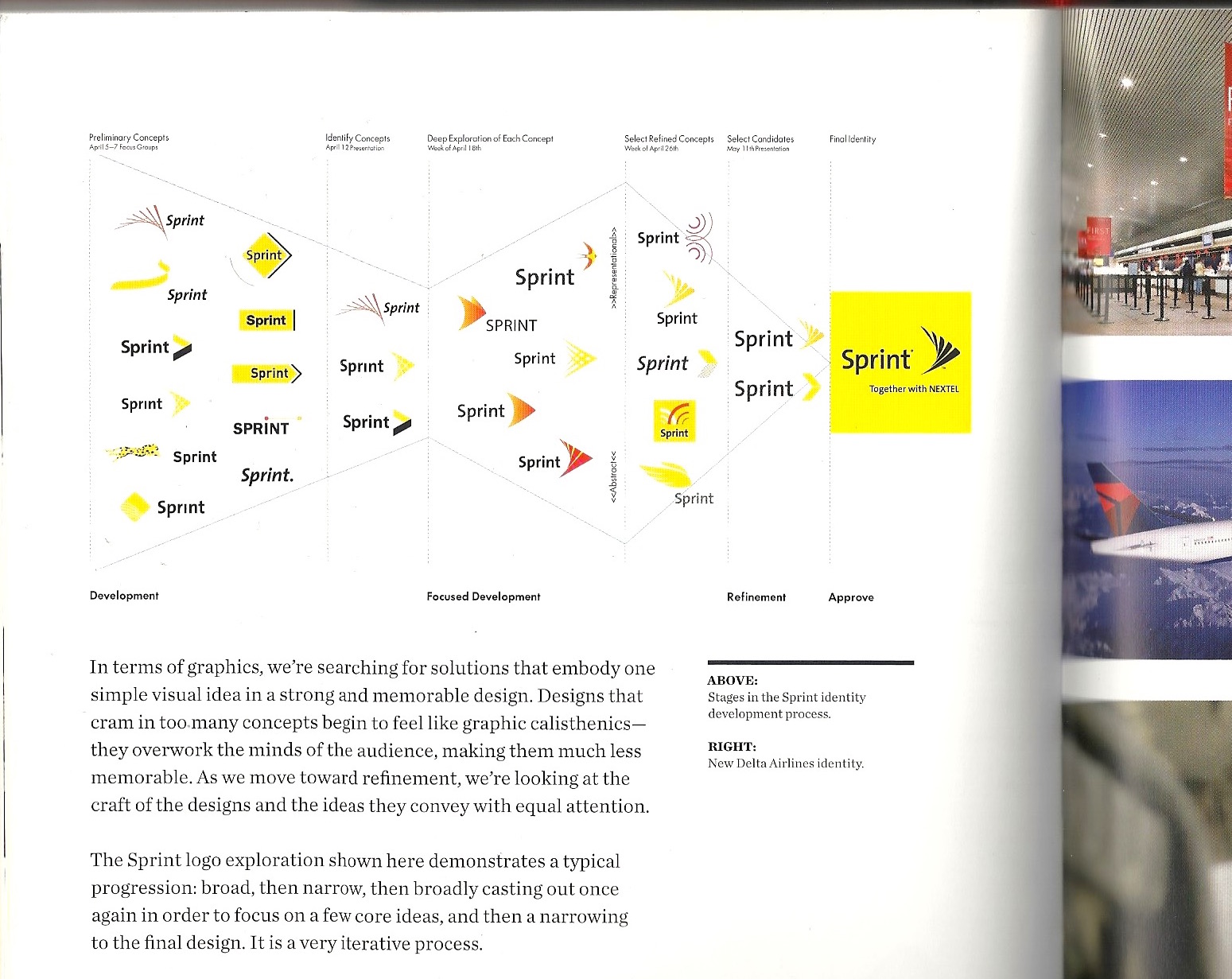
Linear design processes feature an initial research stage, followed by a using of any insights gathered in order to inform concepts. The primary feature of this is in 'expansion'. Many a design consultancy website will show a large creative looking spread of post-its and brainstorms, as the team comes together to turn their carefully picked out insights into brand new ideas. The sky is the limit. IDEO are masters at this.


There are some issues however.

Why spend one or two weeks coming up with an exhaustive number of ideas, to then throw them away? The contraction phase of the project, In my experience, often leads to one just choosing the idea they always liked.

Why spend one or two weeks coming up with an exhaustive number of ideas, when you could be spending all the time coming up with ideas? Granted, this is what one does anyway, but the 'model' process should at least take this into account.

Most good ideas already exist. And by that I do not mean that they are on the market and selling in the millions, but most of the last 10 years of innovation milestones have not come from a quick thursday afternoon post-it session, but are things like the iPhone, iPad, electric car and social media, which in some latent, sci-fi sense always existed, they were just waiting for people, technology and the economy to 'deliver' them.

I think the reality of idea generation is that we are really looking for random inspiration, and finding some systematic way of assuring that. So one good idea is to do some deep initial research on a given subject, and hope something pops out to you that hadn't occurred to anyone else before. But this approach is not per se any better way of finding random inspiration than doing, say 15 mini-projects, going on a three month travelling trip, or going to a zen retreat.


Uncertainties Rule

One problem that designers and, later, engineers find is that on a given project, each jump forward also yields a massive leap back, as assumptions made in the prior stage are shattered by new findings. The 'grim technical realities' take hold. 

Some ideas, such as Phoneblocks, which became google project Ara, went viral too fast. While an impressive example of a minimal design becoming an expression of a pure conceptual whole, it was merely a icon for the idea of a modular phone and nothing more.


The grim technical reality is that for a number of reasons (motherboard bottlenecking being the most prominent) it is not as simple as it looks in implementation, so Phoneblocks sits happy as a well-rendered and iconic suggestion of a future unlikely to ever happen. The design becomes yet another peice of design media, destined to be just that.

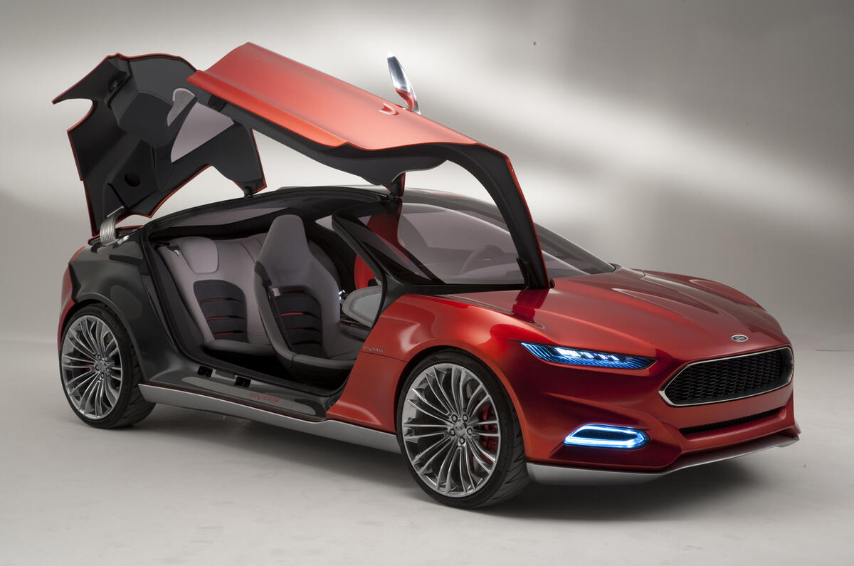
Other ideas are simply watered down for delivery. We see this often in car design, where we are offered a 'peek into' the design process to see a fantastical concept car, which are often only interesting in the degree that they are infeasible.


Usually what happens next is all the interesting stuff gets taken off by the engineers in the delivery stage and we are given the same old car in a new shell, although this is being challenged by the likes of tesla (who don't seem to subscribe to the double diamond methodology).

What is interesting is that the uncertainties don't stop when a product is released. Some ideas like the apple TV and, I may argue, the apple watch, have not properly taken off yet. So they are toyed with and re-evaluated, re-branded maybe in the hopes that they will be revived. Only 56% of new products are successful. (PDMA US Survey 1990,1995,2000) The 4D's doesn't really take this into account, our main problem with it is that in showing the process as specifically two diamonds, it ignores the fact that design is a constantly ongoing and thankless task, instead it prefers to settle at 'deliver' by week 10.

One industry that works in an interesting way in this regard is software, especially the video games industry. Here 'beta testing' and 'early access' are becoming the norm at the expense of fixed, single price releases. Minecraft, one of the most successful video games of the last 10 years was released as a small project and has been continually updated and refined since. How can this influence the way we think about product design?


Design as an intuitive process


Design in it's more 'serious' forms - Corporate R&D, Design Engineering and Consultancy - clearly require certain measurable amounts of accountable progress. Especially those that are beholden to their investors and marketing departments. But a lot of what has really changed things in the last 20 has come from 'headless chickens'- the aforementioned example of Minecraft and 'Notch', the apple computer with Wozniak and Jobs, the world wide web with Tim Berners Lee and Facebook with Mark Zuckerberg.

These were tinkering passion projects that became something bigger than intended, through a useful mixture of dogged determination and of being-in-the-right-place-at-the-right-time. Many of their pioneers found themselves in a favourable position and, with little professional experience, took the right opportunities.

So when we think of who is going to deliver the Next Big Thing, and how it will be delivered, we can almost be sure that it won't be from a giant like IBM, Ford or 3M, but probably from someone tiring away in a garage or in a university dormitory on something pointless. If your design process is organised and accountable, you're doing something wrong.


So why does the myth persist?

Rapid design with throwaway ideas, and the iterative process have recently been beneficial for me. I worked though at least 4 final concepts, before throwing them away and developing something different. At the end though, in my final submission to a rather important client, all that work had to be masked over/ thrown away. An idea is best presented as a Bish-Bash-Bosh of Problem-Insight-Solution, or simply cleanly presented with as little etherial justification as possible. No need to risk sounding unsure about oneself. 

Ideas for commercial release need to be very clear and specific in their intention in order to generate investment and to enthuse the public. This clarity may be arrived upon by failing (internally) several times before coming up with something suitable for release, but it must be cleaned up before it is shown to the public. Apple are masters at this.

In Objectified, Jony Ive talks to the viewer about the design process at apple, and how it manifests itself in a design language. I have taken a rather extensive quote:

"So much of the work with the macbook was experimenting with different processes... so many of the products around you want to make you very aware of how clever the solution was...[what we focus on at apple is]...not the terrible struggles that us as designers and engineers had in trying to solve some of the problems"

I think from a marketing perspective, letting consumers too close to what in reality may be an erratic design process, is not just annoying and not interesting, but risks communicating uncertainty. You're better showing off one half-good idea confidently than giving the consumer a choice. This is especially the case in hardware design, where a fixed lump of material is exchanged for a fixed lump of cash in one transaction.

What this means is that even internally in the industry, from tarted-up student design journals, to professional portfolios, to multinational trade fairs, the exciting and productive world of making mistakes and having-no-idea-what-you're-doing is hidden under the carpet. This costs the design world an opportunity to celebrate the world of the mad and creative, but also of the visionary and  pragmatic ideas that need to be brute-forced over several years out of solid steel or C#.


***

So is the linear design process, and specifically the double diamond, a myth? Yes and no. Projects do overall need to follow some progression in terms of meeting final aims, so measuring and aiming towards this is a good way of trying to plan. It is also a useful educational tool, and it probably gives structure to corporate projects where  they are otherwise lacking in motivation. That’s probably true, but isn’t a very exciting conclusion. I think in reality design is both less and more complicated than we give it credit for.

There are really, in my opinion (or at least this week's opinion), two centrtal and complimentary components of the 'design process' over any length of time or amount of definition these are:

Realising Inspiration


and

Trial and Error


Realising Inspiration is about finding inspiration (which will more than likely be random), and increasing it's specification and resolution. this is equivalent to the Define and Deliver stages of the double diamond, although I am not suggesting here that there are only two, there could be 50 realisation stages in designing a piece of jewellery, there may be only one in designing a £1.3bn bridge.

Trial and Error is the acceptance of failure as a central component of the design process, in this case, we take out 'realisations' and force them to breaking point. We can do 50 at a time to find the best one, or we can do one at a time and constantly improve upon it. This can be seen in software engineering, as updates are constantly streamed to our devices, but also in more solid objects, such as the commendable Porsche 911 which has seen gentle updates throughout it's astoundingly long life. Dyson actually do have a marketed and presented design process that resembles this, especially the focus on trial and error. The submission page for the James Dyson award specifically asks for it.

My intention here is not necessarily to destroy the double diamond, but to remove it's main flaws - the fact that it relies on 'expansion' over any other kind of random inspiration, and the fact that it is conveniently packaged into whatever length of project that budgets or college timetables require. In reality the specific type of process needed is dependent on what is required from the project. In some cases even, it is interesting to pick a process first, and see what comes out of the other end. It is always enjoyable though. Bring on the next one!


03 April 2018

Helveticism - DT05

My fifth D&T blog post is (vaguely) inspired by a talk we had at the Glasgow Art School venue, organised by Communcication Design. The talk included various graphic designers and type designers introducing us to their craft including Imogen Ayres, the founder of independent type foundry Möbel Type, Erin Bradley-Scott, a hand sign-writer based in Glasgow,  and Guðmundur Úlfarsson, one half of the Icelandic/Danish type foundry Or Type.


Instead of focusing on their contributions too much however, I intend to quickly sidetrack this post towards a discussion on my number one love in the world of typography, Helvetica.

Helvetica was designded by Max Meidinger and Eduard Hoffmann in 1957, as an attempt by the Haas foundry to intoduce a new modernist grotesk font, closely based on the precedent of Akzidenz-Grotesk which came from the 18th century. It marked a turn away from more geometric fonts such as Futura, as the world was quickly taking up humanist, modernist typographic principles as part of the new International Typographic Style.

The book 'Helvetica forever - Story of a Typeface' (thanks Duncan) contains the whole story, but it's most interesting pages are the scans of the physical design journey which take us through the intricate process of the two designers in crafting this exceptional typeface.


It is clearly not a boring font; firstly, it does not suffer from the geometric temptations of fonts like Futura, and as the above documents prove, it has proven itself as a relatively hand-crafted creation - the ambition, I believe to find the essence of the typed form.

It certainly caught on - It was well adopted by graphic artists such as Massimo Vignelli, Otl Aicher and Josef Muller Brockmann, famous for his book Grid Systems in Graphic Design. And has subsequently held power in the graphic identities of some of the biggest world brands, as well as my examples of 'high design'. My focus however, is not on it's application as a highly considered phenomena of the design world, but on it's ubiquity. As ESTHETACORP has proven, it's everywhere. And, more importantly (and not for the worst), it doesn't always find itself in beautiful, highly considered situations.


The fact that it is everywhere is nowhere near a problem with the typeface, it is probably it's best attribute. Helvetica is a font with a highly proven visual power, and even if it didn't have this power, it is still used with such ubiquity that it has built up notoriety through repetition. When used today, it is used both as a filler, where making a decision on what font to use is seen as too much bother. More importantly, as the-font-of-all-fonts it is the font a designer chooses when they purposely want to 'join the club'.

The rise of comic sans, arial and calibri in hyper-amateur design has made the apparent presence of Helvetica seem even greater, compared to when it was actually the default font of typesetting. The uninitiated probably don't notice consciously, but the semi-initiated know it is the first choice to make. At the higest level, the use of Helvetica could even be seen to be a kind of 'in-joke': using Helvetica seems purposeful and conveys that you are joining in with the continuing celebration of graphic design that Helvetica has always been part of.

In the film Helvetica by Gary Hurstwit, this stature of Helvetica is questioned by the likes of Dave Carson, Paula Scher and Stefan Sagmeister. They look to promote creativity and individualism and to oppose the constraint that Helvetica apparently represents. The film gives us a good look into the offices and workspaces of these revolutionaries, which is an interesting look into the world of postmodern and 'grunge' design.

Office of Erik Spiekermann, Helvetica

They're all very boring, aren't they?


Office of Stefan Sagmeister, Helvetica

Office of David Carson, Helvetica

Now, one could definitely accuse me of Ad Hominem here, but if the most cursing of Helvetica's critics are unanimously in favour of Apple, Herman Miller, Artemide Tolemo's, beige furnishings, white walls and Vitsoe style shelving - the Helveticae of their respected categories - then something in the postmodern revolution is amiss.

Office of Paula Scher, Helvetica

Clearly, the domain of these designers is in the graphic world. They are looking to free the graphical world of what they perceive to be boredom, and are employed to do as such. But when they themselves are presented with the opportunity to choose design of a different scale, they go straight for the default.

When the need arises for a comfortable, helpful and useful solution, Helvetica - and what I will term Helveticism, when applied to design solutions of a different scale - is the solution. The golden mean. Most of these design solutions come from the same era - the apex of modernism. Helvetica is conformity perfected. That's how it always was. Haas were in some way only copying other typefaces, they just got it right.

Where a design solution looks to 'expand possibilities' on a certain scale, be that Architecture, Interior, Product or Graphic, the fundamental inability of humans to stretch to a total vision inevitably leaves them lacking in 'excitement' beyond a certain stretch.

Fondation Louis Vuitton Interior, USM

Fondation Louis Vuitton Interior, USM

For example, the interior of the Fondation Louis Vuitton by Frank Gehry, perhaps one of the most expressive pieces of architecture this century, inevitably accepts Hevelticism as an interior and product solution, in it's USM furniture, Tolemo Lights, beige walls and, hell, even DELL computers.

And Karim Rashid, one of the most colourful and exuberant product and interior designers, literally has most of his office's website set in Helvetica, showing him in all white, wearing all white.


Shots of his own office reveal strikingly modernist air vents and rectilinear architectural forms.


And I can't really criticise interior design projects, given that they have no choice but to be situated in the architecture they are for, but rectilinear forms and minimalist details here actually give the rest of the products, graphics and textiles space to breathe.


Now i'm not trying, not here at least, to destroy individualist design and exploration; but in a long post which started on type design and distracted itself along the way, I have shown that there might be a golden mean, a background we have already agreed upon as being basic, unobtrusive and fit for purpose. I have called this Helveticism.

While the individualist designers fight conformity, there are those of us that don't want to encourage conformity per se, but seek to adjust and improve the 90% of a persons life in which they are too tired to give it their own spirit.

The focus is to maintain and keep up the high standards of Helveticism. As we have seen, even the most avant-garde artists will use the same plug sockets as the rest of us. An effort to impart individual expression upon every facet of ones life is both futile and counterproductive.

The most strict adherents to this dogma will, of course, take it the whole way: use Apple, drink coke, wear all black, sit on Herman-Miller and write in Helvetica (or in unadorned '< p >', as is the case in this website). But more generally it is a celebration of the beauty of the negative space in our lives, and an aspiration to place our focus there and to make it even better.

Long live the king.