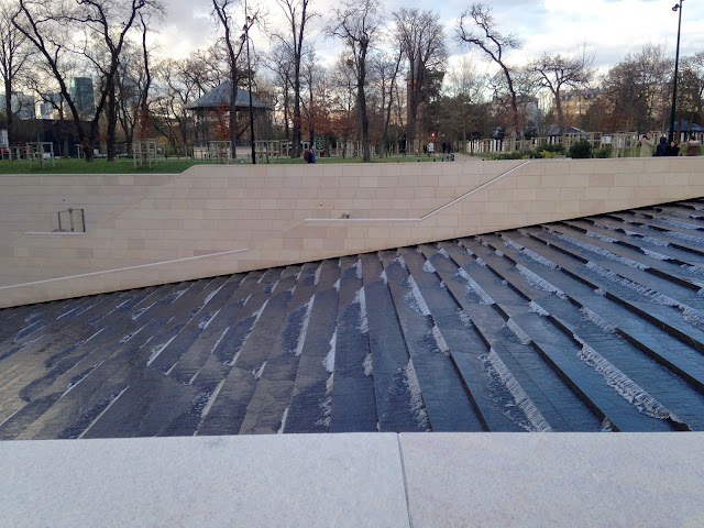
Now, i'm not going to spoil the fun straight away, the building does have a really nice water fountain.
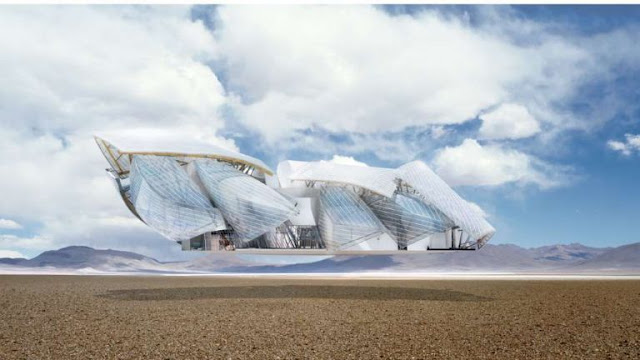
So there's an okay view from the approach, although it's hard to gain an appreciation for the overall vision.
See the actual building there, peeking below though it's expansive quilt?
But what Frank Gehry + CAD Monkeys LLP have forgotten in their grand plan is the rather significant forest that faces the site.
So, unlike Bilbao, a place that has unfortunately become synonymous with that misplaced piece of tinfoil, you can't stand back and look at the thing. What that means is the public are forced to appreciate the building like they would any other building, next to it and from ground level. So begins my study:
Frank Gehry, Master of the human scale.
(The building as it would be experienced day-to-day)
This building shows absolute disregard for his surrounding people and surrounding area. Is this Building a spectacle? a sculpture? an expression? an advert? This might be the worst style of architecture possible. Most PoMo at least had a use. Gehry, Hadid and Libeskind are just scribbles for hire. Maybe some dreary, post-industial cities are desperate for an architectural boost (naming no names), but Paris? This building is a waste of perfectly good grass.
Well, At least we've got that text book to look forward to.


A clean and minimalist blog layout that highlights Paris and the iconic Fondation Louis Vuitton with elegance and clarity. The simple design keeps the focus on culture, architecture, and thoughtful storytelling. Just as strong foundations support great architecture, reliable Payroll and Pension services provide the essential structure businesses need to manage their teams efficiently and stay financially organised.
ReplyDelete