tom lever blog

31 March 2016

Paris IV

So what do I like?

More specifically, what interests me architecturally in and around paris?


Le Corbusier.

The set up goes like this, show this picture to someone who doesn't know much about architecture, and ask them when they think this building was built. They say something like '1960', and you smugly reply 'well actually... it was built in 1930....' then you lecture them on the forward-thinking attitude of the early modernists, until they leave or admit that they like Frank Gehry, and then you leave. Maybe that's just me.

Villa Savoye is a genuinely great building though. The 'architectural journey' through the building is very well considered, culminating at what i'm led to believe used to be a good view.


Light comes in though the building in new and interesting ways, and theres a lot of glass space.


What struck me the most is the fact that there is nowhere in the building where you can't see green. Well, there is this tiny space you can stand in on the stairs and from there you can only see the sky, but I couldn't find anywhere else where I couldn't at least see the tops of the surrounding trees.

Le Corbusier, if I remember my reading correctly, said that he was an outdoors kind of man, who spend a lot of his childhood leaning about and appreciating nature. His aim, he claims, was to integrate the built and the natural seamlessly. From the point of view of someone within the house, this is achieved. The white walled purist look of this house may seem to conflict with nature, but I would argue that though clean contrast, and in being raised from the ground, it becomes semi-invisible.


As the first proper building of the purist movement, and in being designed as a manifesto first and a house second, It isn't perfect by any stretch of the imagination, the roof would leak, and the big windows let in the cold, but these are very technical problems, to do with limitations of 1930's technology, and poor detailing, and most certainly not fundamental issues. 

What is most, most, most interesting about this plot though, is not the Villa Savoye at all. It is the Gardener's House. That is a manifesto.


Le Corbusier took the opportunity with the Gardener's House to present his actual vision for the home of the future. This is his (and Pierre Jeanneret's) vision for what they call the minimum one-family house, the principles of the Villa Savoye, and purism in general, are used to produce a house that could be built and used to house a regular family. 


I think that this shows that Corbusier actually felt hemmed in by the fact that the only way he could build was through luxury commission, what he really wanted to do was design with a social purpose. We see this, for better or for worse, in his later works. What it also shows was that his early architectural language was actually something that could work in different applications and was an actual vision for the future should be. Taking the train back to Paris, we can see that early Corbusian architecture has actually found it's way into the city, and is woven into the very fabric of the old City.

There's obviously, from Corbu himself, Maison La Roche, tucked almost invisibly into a back alley:


You have some that recall the Looshaus in vienna:


Some are a bit dirty looking:


Some are confident enough to face onto one of the many public spaces.


And this cute little street is a perfect example of how early modernism really does work in an urban context.


So there are mixed results, but this is what good architecture should do, it should be a model for all new building, it should be a genuine vision. These modernist buildings, in general, fit in to the areas where the traditional architecture of paris stands, as a neutral backdrop. It also makes for not-too-boring a townscape on it's own. Now, I get that some buildings may want to be grand and impressive, but they can't all be. The city is the ultimate objective of all design.


24 March 2016

Paris III

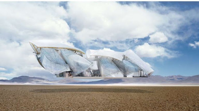
The Fondation Louis Vuitton sits proudly in the middle the Bois de Boulogne in Paris, a self-proclaimed icon of 21st century architecture. Here's how LVMH would have you see it:


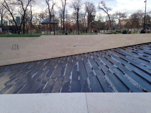
Now, i'm not going to spoil the fun straight away, the building does have a really nice water fountain.


And provides for some pretty good engineering-textbook-front-page-photos.


So there's an okay view from the approach, although it's hard to gain an appreciation for the overall vision.


See the actual building there, peeking below though it's expansive quilt? 

But what Frank Gehry + CAD Monkeys LLP have forgotten in their grand plan is the rather significant forest that faces the site.


So, unlike Bilbao, a place that has unfortunately become synonymous with that misplaced piece of tinfoil, you can't stand back and look at the thing. What that means is the public are forced to appreciate the building like they would any other building, next to it and from ground level. So begins my study:


Frank Gehry, Master of the human scale.


(The building as it would be experienced day-to-day)


This building shows absolute disregard for his surrounding people and surrounding area. Is this Building a spectacle? a sculpture? an expression? an advert? This might be the worst style of architecture possible. Most PoMo at least had a use. Gehry, Hadid and Libeskind are just scribbles for hire. Maybe some dreary, post-industial cities are desperate for an architectural boost (naming no names), but Paris? This building is a waste of perfectly good grass.

Well, At least we've got that text book to look forward to.


18 March 2016

Portfolio Update

I have added some more stuff to my portfolio site recently, from my first semester of third year.


The GREGGS Jute bag was a reaction to a brief called 'Movable Feast' - “For a selected social scenario, improve the way people eat and drink when there is no table available” - was the brief we were given at the inception of the ‘Movable Feast’ project. Rather cheeky for one to submit a bag as a solution in a Product Design Engineering course, but it was a clean, marketable and environmentally conscious solution.


The project, interestingly, then required us to swap with someone else halfway. I received ‘Social Colours’, from my mate Duncan, a design which aims to make business buffets easier by providing a system of components which serve, and accommodate the eating of, buffet food. The product also aims to smooth out the networking process by using the colour of the plate as a signifier of business area.

The improvements I made to this concept include separation of the food and drink areas, lessening constraints on pod use and allowing for the use of wet food, with or without pods.


To kick off this semester, we were given a brief to design an architectural connection, a joint project (no pun intended) between PDE and the Architecture students. The ‘Y’ joint combines a modernist appreciation of long vertical and horizontal spaces, whilst reinventing the traditional ‘Y’ connection seen traditionally. During this project I gained the title of self-proclaimed workshop wiz.

Yes, eagle eyes, that is the Ulm school ;) sorry Max Bill!

Please find these projects on my portfolio page, or on my Coroflot.

At the moment we are working on a very interesting project with the local community, looking to redevelop the nearby Garnethill park. Another joint project with a different set of Architecture students, this has the added fun of being a live project, set by the council, and including a huge amount of community input and insight. There will be an exhibition in late May, or you can find some of us next week at the RIAS Festival of Architecture in Dundee on the 24th March.


11 March 2016

Paris II

http://www.ricardobofill.com/EN/683/architecture/portfolio/les-espaces-d-abraxas-html

Les espaces d'abraxas was constructed in 1982 as the landmark building of the new town of Marne-la Valée, in the easternmost part of Paris. A 15 minute journey on the RER A from the centre of paris, it, and the surrounding area were proposed as a radical new plan for urbanism in paris, and part of a radical shift away from disappointing post-war building efforts.

As I've said elsewhere, Postmodernism was an movement, which began materially in the late 70's to react to the grey, meaningless and intimidating spaces that modernism, and the associated brutalism, had created in the years from after the war. Marne-la Valée must be one of the most significant and large developments to happen as part of this movement, so I took the opportunity to take it in on my recent trip to Paris.

I had heard things both positive and negative about this place, but most prominent in my mind was a scathing report in Deyan Sufic's 100 mile city. I will take you on a photographic journey through this experience.


One is greeted, when getting off the train, with this staircase as an initial impression of the area. So begins the theme of happy colors.


You are taken to a large public square, habited mainly by noisy French children making what they can of the flat concrete space. Punctuation of this space with architectural 'events' such as above are very frequent, but they seem to have lost their velour in the 30 years since construction.


The heavily applied feature colors and the gabled roofs are what separate this developments from the angry, rough lines of brutalism.


Coming off the square, one finds a vague and puzzling selection of very large commercial modern buildings. I went on a Saturday, so this entire surrounding fringe was completely empty.


Besides the odd friendly Careffour trolly that is. I was puzzled to see these littered around the area.


Approaching the main event, Les Espaces D'Abraxis, we come across this rather large and monumental 'traffic solution'.


I take these views in, on foot, safe in the knowledge that the urban planner didn't give one cent for pedestrian access.


And there she is. The first thing to hit you is the scale (16 storeys?), then the complex staggering of forms, and only then do you recognise the references to classical architecture. The most powerful feeling is a sense of awe. The negative kind.


This is the main vestibule, with walls the size of most Paris buildings, encroaching on a thin channel between the two main residential slabs. The man provides appropriate scale. Above this channel, you see many crisscrossing walkways and blocks, which give the space this abhorrent mixture of proportions.


The walkway opens up to the theatre, herein lies the money shot, the westernmost crescent of buildings, complete with plate glass classical columns.


As I continued to experience this space, a feeling of dread increasingly grew over me. The surprisingly small number of  residents I spotted gave me suspicious looks, understandably, they probably get too many aspiring photographers  intruding on their place. But this brutal cacophony of shapes made me feel really uneasy. 


As an example of ridiculous application of scale, first see our man, zoomed in, and his surrounding space.


That's him there, past that car, with the red bag. How overbearing is this structure?


I approach my way out, leaving by a different route, somewhere through there? I also have found my explination for the shopping trolley. A Careffour supermarket lies just beyond this lump of concrete, and the residents find it easier to take their shopping direct to their door and abandon it.


This image captures again the silly mis-relation between man and building.


And this is our way out. Yep, this, from my observations seems to be the primary pedestrian route in and out of Les Espaces D'abraxas. Ricardo Biofill's vision of appropriate public space hasn't stretched very far if I have to make my daily commute through a 50 meter multi-storey carpark.

Dread was my primary emotion in this aesthetic experience. It would be perhaps be more rigorous of me to do more than affirm my pre-existing beliefs about a space, but I can't find another way round. The witty use of classical elements seemed so coarse in combination with which I can now confirm to be very small and awkward flats. It is all built at such a ridiculous scale as well. In good architecture, your eyes wander around the space, hunting for detail. With this over-saturation of  'detail', I found my eyes looking for a way out.

It's so frustrating to think that this was completed mid-80's. It's basically contemporary. It is already crumbling, access is awful, and the space and the appearance themselves have a reputation among dystopian filmmakers. If one is to challenge the grey, meaningless and intimidating building of the mid-century, then one could do better than to produce something colourful, meaningless and intimidating.