Poundbury: The Good, The Bad, and the Still better than what would be built otherwise.

Poundbury is an urban development started in the 1980s on land owned by the Duchy of Cornwall, and master planned by Neo-traditional architect Leon Krier. For the last 20 years it has developed on the edge of Dorchester over four phases and is still being constructed to this day. It has been a living example of a different way of building new housing, most strikingly because it uses very traditional visual styles of building. It has served as a representation of Charles the Third’s (then the Prince of Wales and head of the Duchy of Cornwall) personal vision for architecture and urban planning in Britain, and is an alternative to both Modernist and ‘conventional’ (Taylor Wimpey-esque) building style and urban planning.
My view on urban planning has been for a long time confused. I have a clear passion for early and late modernist product design, and have been fortunate to see many of the key modernist architectural icons. As the scale of the solution grows however, I have been in two minds about wether the solution to the problem relies more on passionate adoption of technology and new ways of thinking, or in a more classical respect for what has come before.
Poundbury is a bit of a challenge to my personal tastes. In product design, I have always been a fan of modernism and objectivity. I an architecture, I have had the opportunity to be amazed and bewildered by a number of grand modernist architectural ovures - The Barcelona Pavilion, The Villa Savoye and the Iconic centre of Chandigarh, which are individual architectural icons standing up as grand pieces of poetic building, and are moving experiences to navigate and discover.
However, the urban form is in general a harder design problem than one-off buildings and mass produced object. There are several much higher moral concerns than a poetic experience when it comes to the design of a place for a community to live: High density living is requested on the basis that it requires fewer car journeys and brings people closer to places to shop, work and socialise. An urban design which shows respect to what has come before, ages well, and is more pleasing to potential NIMBYs is preferred. Lastly, many conventional building methods have withstood the pressure of the concrete and glass of modernism, especially in house building, and with sustainability at the forefront of peoples minds, it seems reasonable to conclude that stone, brick and wood are the most timeless and durable materials with which to build housing.
The arguments in favour of traditional building appear to preclude the kind of tempting modernist architecture driven by the ideal of the glass house on the plain such as Phillip Johnson's Glass house, Van Der Rohe's Farnsworth house, or the Villa Savoy. The realisation that traditional building styles, both in visual and structural longevity are probably the sustainable answer persuades against the kind of 60's modernism we see in varying quality from the highs of the Barbican to the lows of ... well, most of 60's modernism.

Poundbury is often presented as the antithesis of modernism, a new-old solution to sustainable urban planning. It comes up time and time again as an example of post-modern planning, offering a breath of fresh air from both modernist planning and typical new build practice.

Besides the obvious and striking immediate difference in how it looks in comparison to other new buildings from the 21st century, I would argue the principal differentiation of Poundbury is the idea of expansion through duplication. This is where a city or town is enlarged not by adding suburbs that look inward to the existing urban core, but by creating an equally powerful centre of its own. This should have the effect of reducing into-city travel, and therefore traffic, but also creates a new centre for a community to gather, giving a sense of place and meaning for the residents.
Poundbury also challenges the establishment of the visual design of building, using both classical and vernacular architecture in the design of it's buildings. Leon Krier and Charles' ambition here is clearly to create new towns that look like old towns, but such an undertaking requires an understanding of the fundamentals of what good historical urbanism is. Krier's 'civitas' illustration defines this clearly - civic pride in monumental traditionalism, spread throughout the town at focal points, irrigated by a fabric of vernacular building which ties together the town at a human scale.

The Good
Urban expansion through duplication

Poundbury is a clear example of Leon Krier’s principle of organic expansion through duplication. The principle posits that it is better to expand a town or city by the creation of another district next to it, one which also has its own services, places and cultural landmarks.

Poundbury has been created as an extension to Dorchester, and unlike the imagined ‘conventional’ new build estate, it has been created as its own, more inwardly looking development. It has its own shopping areas, a grand central square, and its own quasi-industrial workplaces.


Theoretically, this has the benefit of creating new urban areas which avoid placing additional traffic and services strain on the centre of the parent town, and in giving people a new place to live with its own spirit. This seems mostly to have been successful in the case of Poundbury, where modern businesses have taken residence, such as Dorset Cereals, they also have plenty of shops and at least one pub situated on queen mother square.

I also think the inwardly looking, duplicative approach is having an influence on new developments. Around Cambridge, new development in Trumpington and Eddington have an emphasis on the creation of new squares with community centres, convenient shops and places to hang out. This both makes living here less of a chore, and also gives these places a distinct identity and sense of location. More broadly, the discussion of the 15 minute city has become a controversial political question and has therefore risen high up the political agenda.
Traditional building visual design
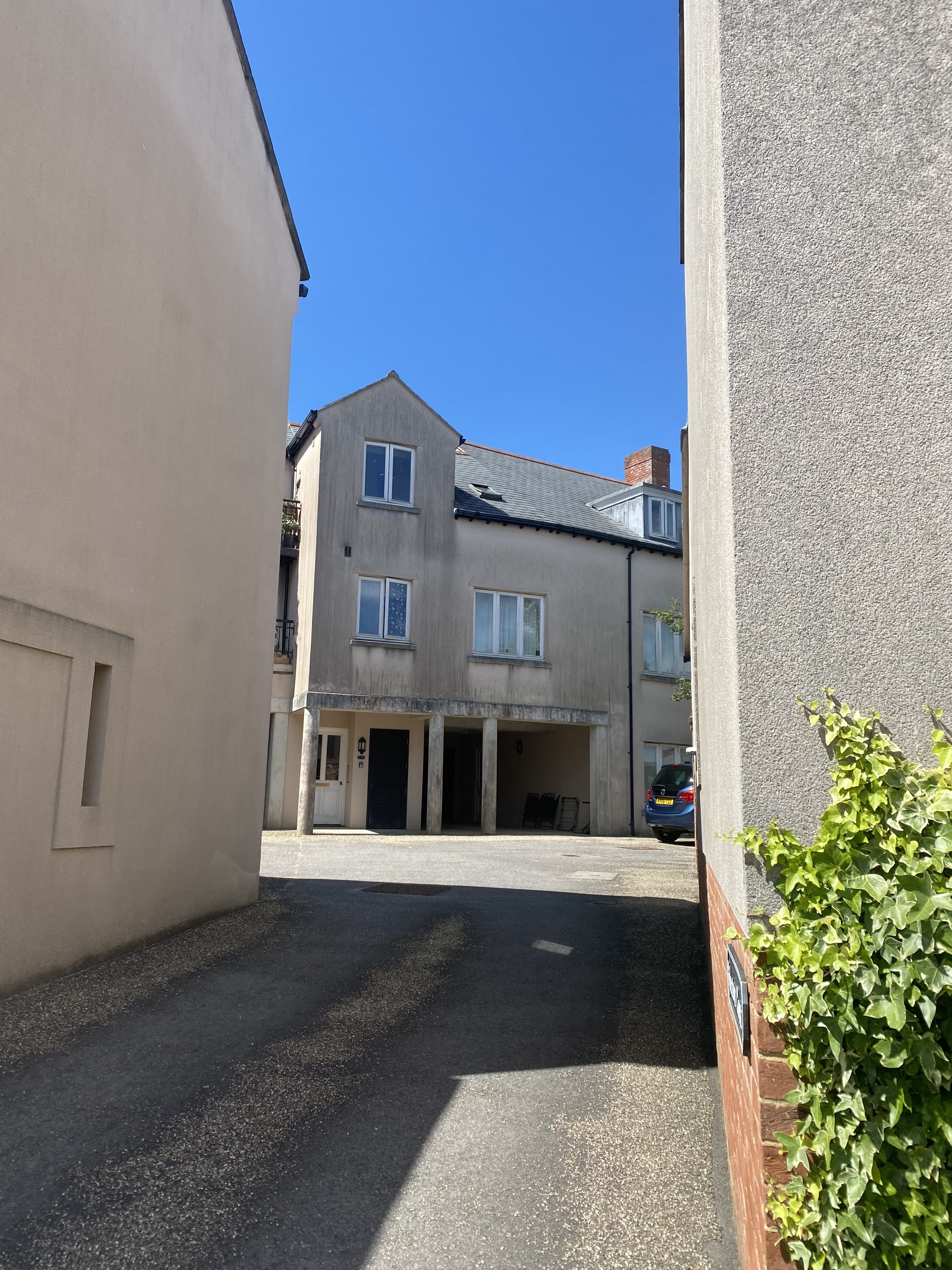
The second key aspect of the plans at Poundbury is the adoption of a strongly traditional building style. Architects like Ben Penreath and Quinlan Terry have contributed to a set of buildings which have a wide span of architectural styles, assembled pseudo randomly, in the way they might sit in a town that has grown organically since the medieval period.

There is a somewhat random mix of Georgian semi-Palladian houses and those with more vernacular elements. There are also houses and buildings with a slightly more jazzed-up postmodern take, with geometric windows and prominent arches and pilasters. The housing types are also varied, with townhouses adjacent to semis, and sometimes coach houses or mews houses nestled behind the Main Street fronts. In line with the ‘civitas’ arrangement shown earlier, there are more exuberant Neo-Classical buildings nestled into the urban fabric, at landmark points such as Queen Mother square - which is where Poundbury is at it’s most grand and pompous. The overall plan is one with many quaint views and interesting street-scapes that are rare for a ‘conventional’ new build.
Since Poundbury has been started, another alternative to ‘conventional’ style has become the norm in many medium density developments in the UK. The New London Vernacular takes some learnings from the proportions and materiality of neo-traditional building, being somewhat Georgian in form and utilising flat faced brick for most of its surfacing. One assumes it is easier and/or cheaper to build in this way than going fully for a replication of Georgian styles and especially in omitting the details required for traditional architecture.
The style of Poundbury’s buildings may be criticised as ‘Disneyland-like’, as an artificial simulacra of a traditional main-street. Having visited and walked around, don’t necessarily think that Poundbury ‘feels’ like it is trying to con us, and even if it is it doesn’t seem like much of a problem. These are real buildings, so they are places that real people live and work in, and so in that sense it is a ‘true’ place.

My estimation is also that, on balance, a place like Poundbury does offer housing and streetscape that would be more appealing to the average potential homebuyer. Many sources exist to prove that people generally prefer traditional styles, and with their more traditional manufacturing, and more traditional layout, I think that Poundbury’s houses feel more ‘real’ in context than a collection of individual houses in the developer-spec new build style, which often has a more half-hearted adherence to traditional and local vernacular than Poundbury.

The Bad
Transport Sustainablity

Poundbury’s transport system primarily consists of a network of streets which have little to no markings, signage or clear hierarchy. A criticism of Poundbury I hear a lot is that its streets and design are too car-centric, and that the lack of markings and hierarchy are intimidating to untrained visitors.

It is true that many of the newly created squares, designed to look like village centre market squares, have been filled up with cars (much like they have been in the real traditional villages), and in having no road markings there is no explicit priority for pedestrians or cyclists, were they to chose to walk or cycle.
Nervousness about the lack of painted infrastructure for safer cycling is understandable, as people looking to take up active travel have varying preferences as to what they feel is safe - wether that’s completely separate Milton Keynes style pathways, or well-used Cycle Superhighways, separated but still adjacent to primary routes. Poundbury has neither of these options and instead has wide open streets punctuated by parked cars.

There is also little visual evidence of any commitment in Poundbury to Public transport. It appears there is a relatively conventional bus travelling through Poundbury, and the nearest train station is that of Dorchester. Other new developments, perhaps in London, Manchester or Cambridge have done better to be integrated into wider Metro Rail, Tram or Busway transport systems. However, Poundbury is a development in a relatively rural setting, and so the core infrastructure and local funding to enable a transit-oriented neighbourhood is not easy to achieve.
Materials and Finish

While the traditional style used in Poundbury, as I have argued, is probably for the better, and efforts have been made to stick to traditional manufacture, there are some cracks in the facade occasionally.

I visited two of the more public buildings, which while neo-traditional on the outside, had a kind of steel beam and cheap wood interior. This had the effect of making the spaces feel unfinished and fake.

There are also examples throughout the town where plaster and render exterior surfaces have succumbed to ‘new build rot’- a case of strange grey and red patches which I have noticed elsewhere in new builds, especially where a plain white finish is desired.

The ‘still better than what would be built otherwise’

Given the above discussion, Poundbury can be an easy target, either for those who disagree with new building more generally, and are easily disgusted with the idea of new builds destroying local green space, or by those who object to a backwards-looking architectural style. However I think Poundbury is on balance better than the alternative of conventional new build estates.
While sustainable transport offering has room for improvement, and it is indeed still a relatively remote location, encouraging car use, I think the mixed use streets are relatively quiet and easy to walk around. The fact that it is not adjacent to a much larger town, and therefore not adjacent to things to travel to mean that the potential for grand cycling schemes or public transport is simply not there. I don’t see that cycling if you wanted to would be that much of a grand endeavour. It is also the case that the mixed use scheme means that intra-town trips are short and convenient, which should make a quiet walk adequate for most daily needs.
While it is true that there is evidence of the use of ‘bad’ materials and a certain amount of early decay, I think this is mostly a general problem in today’s building industry. Largely, what I saw at Poundbury was better than what I have seen from new-builds of a similar age. It is clear there is an intent to use a blend of traditional and modern methods, and so it’s not somewhere with painted fibreglass panels falling off, held together with scaffolding. For these reasons I think it’s plausible that the average person wouldn’t immediately feel they were in a Disneyland style concoction. There is also a sense of real ambition to plug holes in the current building offering, for example there is a site, part of the development, which houses a Stonemasonry school run by Weymouth College.
It poundbury better than the alternative?
With Charles now King, and with a new Labour Government at the helm, an interesting question is, what if the methods of Poundbury were incorporated whole-heartedly into a new system of urban development. Would the country be a better or worse place?

I think a large part of the fair criticism of Poundbury is built around points that are inherently tied to the fact that it is a semi-rural new build. When you look at elements that are within the control of the architect, it generally does a better job than ‘conventional’ new builds of being at a human scale, being configured to allow local services and businesses, and being attractive to most people.
I also feel like Poundbury gets unfairly criticised because it gets close to, but doesn’t exactly meet, the feeling and vibrancy of an actual old town. The tight roads and traditional layout draws comparisons to ‘real’ county towns, which, by virtue of having been established for 1000s of years, have more foot traffic and wide selections of local stores and amenities. It is not neccesarily existing old towns we should be comparing Poundbury to. The alternative to Poundbury is a ‘conventional’ new build estate like Northstowe in Cambridgeshire. I think Poundbury does a lot better in vibrancy and feeling of community than the alternative, and I think this is chiefly because it’s architectural style and urban layout does well to ape those of a more traditional town.
Looking at the wider portfolio of Leon Krier’s work, there are examples and explanations of how similar buildings and plans would also be incorporated into more medium-density urban context. This is where I think a renewed focus on traditionally scaled urbanism would have a significant benefit over existing mid-density schemes; which typically have large underground car-parks, little active frontage and a tangle of dual carriageways.
Is building poundbury everywhere feasible?
One negative to adopting the poundbury style could be to the speed and cost of building. Poundbury has developed relatively slowly, first ground being broken in the 80’s. There are elements of Poundbury which reasonably would lead to higher building costs and longer time-scales: taking time and care to incorporate local vernaculars and sensitive designs; trying to incorporate and train local manufacturing and traditional construction skills. If these are to reduce the speed of delivery and increase the cost of new developments, in the context of a housing crisis, then it may not be politically favourable.
It may also be the case that Poundbury’s methods may not easily extend beyond developments on Charles’ land and under his watchful eye. Developments in the new build style, next to a standard A-road, with a Greggs/Costa Coffee/Aldi just off the roundabout are probably much more efficient to build and easy to approve. Local governments are likely cash-strapped and under a lot of time pressure and so taking the time to oversee a sensitively built and ambitious building in this style is probably difficult.
Conclusion
Looking back though what the key benefits of Poundbury’s development style have been, I think the one most relevant to building renewed urban fabric is the idea of expansion though duplication. This style of urban planning is having an impact on the way medium density developments are being built today, with some newer developments looking to create mixed use and mixed income schemes.
The separate issue of visual style is more of a mixed discussion - most low density new builds are built in a pseudo traditional style already, however it is rare that both traditional style this extreme and mixed use development are combined in such an ambitious, somewhat pompous manner. As we progress into the second quarter of the 21st century, the intellectual battle between the New London Vernacular, ‘conventional’ building, and full Neo-Traditionalism continues as a battle of three sides.
Poundbury is still being built, and it now has many sister villages thought the lands of the Dutchy of Cornwall. I think it stands as a great study in the possibilities of strong architectural and urban vision, and is likely to be a loved home for many people. In addition, it’s views on urbanism may prove to have a more novel impact on the wider practice of building in the 21st century, as many new, high quality developments are incorporating aspects of varied streetscapes, mixed use, and community focused landscaping into the overall design.


