tom lever blog

29 June 2017

Kettle 04 : Aesthetics

Kettle Project : The Market  Teardown  History  Aesthetics  Process  Concepts  Costing  Induction


CAD on Fusion 360


Outward progress this week is hard to communicate, as my main focus has been to recreate my current kettle on CAD. After a successful social media campaign, I have caved in and decided to give Autodesk Fusion 360 a go, which is useful as I can run it on my Mac. This gives me a steep learning curve, and so re-creation is an essential part of learning about the kettle parts and also getting used to the software. Some of the data may be useful in the design stages at a later date.


My first starting part is the main body of the Strix R7 controller, which is very complex, but gets me used to all the solid modelling components; mainly the easy stuff like sketching, dimensioning  and extruding.


Good Design? The current market


My received conceptions of 'good design', in an academic sense is that products should be a combination of a total aesthetic and a total functional whole, that is, that they should be functionally brilliant, and aesthetically impactful; and that these two wholes should combine into something that clearly communicates it's intention to the market.

Given these lofty, philosophical criteria, I find myself admiring strict, logical and functional designs.


One such example is the Ritter Fontana 5:

"...produced only in Germany. A clear design in Bauhaus style with no extraneous decorations, featuring rock-solid processing & technical perfection. Multiple award winner, partially made by hand, by ritter of Bavaria (established 1905)."

Well in line with the aspirational, neo-modernist line I have generally trodden, this design appears to be a very well executed product, all helvetica, geometric forms and clear functional details. It takes a step beyond mainstream kettles by including temperature selection, and therefore probably a digital controller (although not necessarily a proprietary one). To add to that, it is made in Germany, the knockout punch for any Dieter Rams fetishist, and putting it squarely in the camp of the no-nonscence 'good form' crew, along with Miele, Bosch, LAMY, Volkswagen and Braun.

The price? £140, which is semi-understandable given that isn't made in China, and is made from 'Heat resistant Acrylic' instead of the usual Polypropylene, but I wonder if it is too highly specified, it is certainly not a mass-market proposition.


Slightly closer to the ground, although not too much so, is the Bosch 'City', which arrives at £59, and features another confident but neutral exterior. This is made in China and that is probably where the majority of the cost savings have been found, assuming both are priced with reasonable honesty. Looks familiar?


There are apparently not many ways of designing a 'rational' kettle from these german examples. What we can learn is that we touch black, smooth surfaces, and don't touch the hot metallic or glossy surfaces, and that the handle must be at a slight angle for ease of pouring. We must also ignore draft angles in the initial designs, preferring straight edges, and then uncomfortably accept them in the later stages, as evidenced by the Bosch model's subtly curved sides.


A starkly different option, pure in a different manner, is the Muji Electric Kettle, designed by Naoto Fukasawa, costing £60. A dramatic blend of traditionalism and pure minimalism, it's careful, soft forms compared to the jaunty steel of the german models teach us a lot about the differences between contemporary minimalism and functionalism. This is a very good example of total functional and aesthetic unity in a product, as the minimalism expressed is a functional reality, having only 500ml capacity and a power rating of 1430W. Such figures are laughable compared to my £5, 1.7l, 2200W kettle, this is a very good example of what misfit's architecture has termed 'voluntarily poverty'. Muji are experts at getting people to buy into the idea of having less.

The concept of voluntary poverty automatically separates and stigmatises the involuntarily poor because they have no choice but to aspire to the voluntarily poor. To have the choice is an aspiration in itself.

Climbing further down into the mass-market, we find ourselves at a model I believe to be a solid example of a reasonable middle-ground product.


Taking a blend of both approaches at an accessible price of £30, this phillips model is both functional and minimal. I also think that the base is a clever and subtle solution, probably taking advantage of the seamless nature of a controller like the relatively new Strix KeAi series.

One interesting angle to come at with regards to 'good design' is to look at semi-commerical products.


Simple, unassuming and robust, the Burco KTL02 achieves the goals that the aforementioned consumer kettles merely 'represent'. Products designed for commercial use tend to be heavier duty and less showy, which should please the stoics, however because they are bought by managers as long-term investments for their staff to suffer, they lack the creature comforts that modern consumers expect, in this case the 360 base and flat bottomed interior. Innovation tends not to be the realm of the commercial sector, as the primary concerns are cost-effectiveness, durability, and legal safety.


Looking over to Japan, BIC Camera have this Dretec Model at the bottom of their offering. Impressively designed as base-spec models go, at around £10 this is a sensible and basic kettle, but without the ugliness that we come to expect at this end of the spectrum. Can we put it down to the 'zen' nature of the Japanese public? I'm not so sure, but it is an example of how good, common sense design has no reason not to exist at all levels in the market.

Alessi MG32

Hegel said we should learn from our adversaries however, so I have extended a line of inquiry out of my comfortable grounds of sensible, minimal, functional design and into the realms of postmodern excitement by purchasing a broken Alessi MG32. At £30 I could have bought 6 working kettles!


Needless to say, it does have an extreme Aesthetic presence in a way I haven't seen since I bought the Tizio, the MG32 has a way of filling the room with it's attitude. This must be a sign, however subjective, of it's actual aesthetic content: the kettle is both space-age and weirdly nostalgic. It is also big: it's base is a 30cm circle, which fills the room aesthetically and physically; which confirms my suspicion that statement pieces fill and own the room they are set in, dictating a style. However flowery this sounds, a significant achievement of any product is that it can shout out a style intelligible by anyone in a way more subversive than words can achieve, and I understand that now more than ever.


It is also explicit in it's communication of manufacturing quality: the finish on the stainless steel is exquisite, the chrome steel is both extremely well polished and noticeably flat and consistent. Alessi are known masters of steel processing and finishing, and it is clear from the mirror finish; no dents, no scuffs and clear edge transitions, even though this is a well-used product. It is this subtle quality that people are buying when they buy Alessi; not just postmodern expression, and this, I have found, is undoubted.


What it has missed however, is functional independence. Alessi have missed the opportunity to provide a technical alternative to the hegemony of Strix and Otter kettle controls, and have therefore missed the lofty heights of the Apple MacBook and the Artemide Tizio. Without genuine technical difference, the 'quality' argument is severely diluted.


As evidenced by the technical failure of the product. Here, the generic Strix controller and heating element have let down the longevity of the product, meaning the kettle is not sub-par per se, but definitely only par. Genuinely well-regarded products like say, Dyson vacuum cleaners and Vitsoe shelving have an expensive functional uniqueness which in some way validates the price.


Obviously, Alessi would rather sell the virgin Michael Graves kettle, but they have found themselves yielding to the consensus of the electric kettle market. The price works out somewhat: a standard Alessi kettle costs around £80, and for the extra components, it deserves a price of £150 for the aforementioned quality of construction; but it has failed to reach the lofty heights of Dyson cleaners or Vitsoe furnishings, which justify their price with a full portfolio of genuine functional and manufacturing achievements.

It's red indicator light covers have not stood the test of time.

Which is a shame, because the kettle has legitimately taught me something about the power of a full, aesthetically complete design. 

Good Design

Given these observations, I seek to make a slightly over-confident definition of Product Design aesthetics. Although not attempting to make a global, John Dewey-esque treatise on aesthetics, my back-on-an-envelope description is as follows:


As I have mentioned, there are two independent entities, the functional whole and the aesthetic whole. The functional whole depends on the inter-operation of the functional components, and the aesthetic whole depends on the communicative quality of these components.

"There is no pre-established harmony that guarantees that what satisfies one set of organs will fulfil that of all the other structures and needs that have a part in the experience, so as to bring it to completion as a complex of all elements. All we can say is that in the absence of disturbing contexts, such as production of objects for a maximum of private profit, a balance tends to be struck that objects will be satisfactory - "useful" in the strict sense - to the self as a whole, even though some specific efficiency be sacrificed in the process" - John Dewey, Art as Experience

All we can wish functionally is that the performance of the components and their visual appearance work together to communicate and enable good use; this is basic utility and can be seen whenever a switch looks like a switch and turns red once it's on. A positive and essential basic achievement of good design.

The final stage is the aesthetic and functional unity of the product as a whole. This can be seen, for example in the iPhone, where both the interface and the visual design are developed together to reach something totally whole and understandable.


In this study, however compromised, we can see that the Muji kettle is a very complete expression of form and function. Whatever technical drawbacks it may have, all of it's aspects have been borne of the same, consistent philosophy,  and therefore any criticism is a criticism of the philosophy itself and not of the product. We see this also in the Burco commercial kettle; design that has not yielded to the fashionable sways of whatever generation we are in, but presents a clearly-communicated and sensible option. The Alessi and the Bosch fail in this regard, they are desperate to find higher aesthetic meaning, without the balls to realise this with functional independence.

The conclusion then, it that products are at their best when they are wholly independent and consistent in their philosophy. This is basically how we have come to find our icons: the Tizio, the Mac, the Unite d'Habitation. Having said that, functional independence comes at an economic cost, something that half-way options like the strix-based MG32, android-based phones and Sapper's windows-based ThinkPad have discovered to their demise. All come from good intention but cannot be considered totally designed products.

If we are to design a cheap, useful and emancipatory product, the demands of common economics dictate that we should either invest to steal the whole market, as Apple have done, or if looking to deliver at a low price-point, communicate with honesty about the generic nature of the final product.

This is why cheap design struggles; it is between the rock and the hard place of genuine cost-saving and finace-driven market differentiation. It is the options at the bottom-end of the market that I am most keen to examine; do we sell minimalist-modernism as a 'new' idea, or can we make a statement based on low-cost itself?


21 June 2017

Kettle 03 : Product Design History

Kettle Project : The Market  Teardown  History  Aesthetics  Process Concepts  Costing  Induction

The Traditional Form


When we ask what good design is in the context of any specific product, it is important to first investigate what the iconic, average, common form is of said object. This can be roughly found with a quick google search.


Most of these, especially the ones that are actually traditional kettles, are that of the stove-top variety, a style not of much relevance to the UK. The form is very similar to that of traditional tea-pots, which is no surprise, as they are used in the same way and I suppose their designs would have evolved over time together.


One interesting stove-top kettle to begin on in our investigation would be the Sori Yagani Kettle, designed by Sori Yagani. First made in the 1960's, this product is a careful and sensitive summary of traditional kettle designs that came before it.


Hand crafted in japan, since the 60's, despite not being an actual historical example, the design points us towards many traditional features of the traditional stove kettle: The swinging handle allows it to be stored away (not a regular feature of electric kettles). The wide opening means it is easy to clean and fill. The carefully curved spout, always a feature of traditional kettles but rarely on modern ones, gives the user a more predictable flow which is useful for carefully filling tiny Japanese teacups, less essential for making large mugs of instant coffee.

The wide form is also a functional derivative, on less efficient flame stoves, or similar, a wide, short form reduces necessary internal convection and puts most of the water closest to the heat. Powerful modern 3kW rapid boil kettles need this less as bubbles and internal turbulence begin almost immediately.


 A modernist history of kettle design


As product designers, we tend to assume that history begins in the year 1859. This is largely true, as this was the year of the Thonet bentwood chair; and therefore of mass-production, and incidentally, forms that arise not from careful, gentle crafty emotions, but are derived from the needs and economics of mechanical production.

An interesting proto-modernist form we will turn our attention to is an 1880's teapot designed by none other than Glasgow's own Christopher Dresser.


Here dresser has anticipated the rational forms that would come to define the bauhaus and early modernism, and ripped up the rulebook of the often whimsical victorian industry by delivering a teapot with robust corners and flat, polished surfaces. Alas, he has also ignored the very practical user and manufacturing requirements that were the very backbone of the regular ceramic teapot design. Despite the machine-age aesthetic, this design was before its time and was not mass-produced, a middle class curiosity that was in fact admired for the quirkiness it was designed to reject.

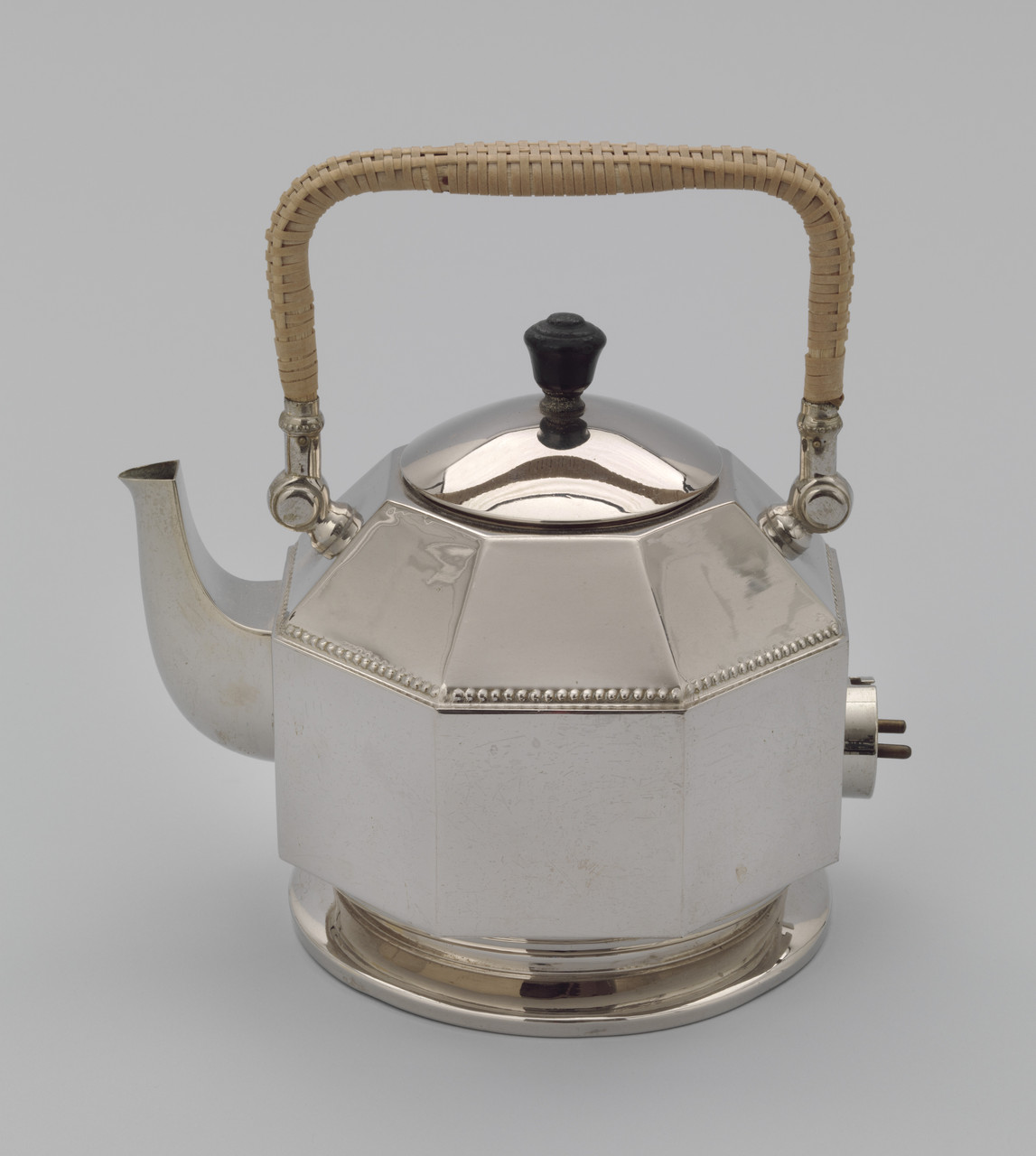
It takes us another 29 years before we find a kettle that is genuine modernism in every way:


Peter Behrens is of course famous for his fully integrated control of AEG's visual matter in the early 20th century. This kettle is of especially high importance because it was also the first successful electric kettle. In overall form, it accepts generally what has come before, but by giving it dresser-like flat polished forms, a sharp octagonal shape, and in replacing traditional ornament with a weld-like repetitive beading, this is a design that represents successful introduction of a new technology by combining the old with the noticeably new.

Another wildly different but similarly inspiring product from around the same time is the Kelly Kettle.


The Kelly Kettle/Volcano Kettle and similar items such as the New Zealand Thermette arrived at the turn of the century as efficient, lightweight outdoor kettles. They have been used ever since by anglers, hikers and soldiers. What these are are examples of actual functionalism and utility, in contrast to the middle-class academic efforts by people such as Dresser. In their absolute, unpretentious and accidental functionalism, they have proven to be absolutely timeless; proof that design on the knife-edge of survival can never be corrupted by the whims of style and fashion.

A coffee maker and not a kettle, but one can't write a post about all things vaguely kettle shaped without mentioning the Bialetti Moka Express.


Another modernist icon to reduce the cylinder to sharp octagonal faces, this confident, forward-looking coffee maker became a best-seller and is still produced to this day. It also was low-priced and designed for manufacture - a sign of real modernism - it's cast aluminium construction was a cheap and innovative reconstruction of expensive silver coffee pots. It's still cheap today, the authentic version still hovers at around £30, cheaper versions can be found for £15, which is a testament to how  the fusion of a good idea with the right amount of style and appropriate manufacture can create a lasting, timeless, emancipating product.

Jump to the end of the war, and we are at the beginning of another revolution.


Earl Tupper's Tupperware, which combined the revolutionary flexible plastic Polyethylene with flexible sealing joints and hinges was a successful early attempt to produce cheap household commodities in large numbers. Plastic isn't quite ready for full inclusion in wet electronic appliances yet, but this early milk pitcher pre-empts all there is to consider when producing plastic moulded kettles. The soft, vague, sloping forms which make it easy to mould, and the free and liberal application of colour signify what is possible in the transition from metal to plastic.

It will take us a long while however for plastic to be considered appropriate to be the entire basis of a kettle however, and in the meantime, 1952 delivers a cool, Scandinavian, mid-century interpretation of the traditional teapot:


Soft, cool, relaxed, this represents everything about the again-popular 'mid-century' period, and takes us away from the brash turn-of-the-century forms, balancing simplicity and utility with flair and market-sensitivity.

Back to the electric-kettle market, and 1960 has some important technical innovations for us.


In 1955, the Russel Hobbs K1 was the first to introduce automatic steam switch-off, but the K2 arrived in 1960 as a more convincing aesthetic whole, and remained the best selling electric kettle in the UK for the next 20 years. Visually, it is a careful combination of traditionalism and restraint, perfect for mass-market appeal. One can also observe that the black controller on the rear-side of the device that is of a very similar general makeup to the R7 control found on kettles today.

Less traditional is the spartan Braun HE1/12 from 1961:


Accepting the language of chrome metal and black plastic, but with a typical Dieter Rams combination of rigid, rigid functionalism and simplicity. A true 'black box' design, doing nothing more and nothing less than necessary, design of the Braun era like this was to be the foundation of more than half a century of reference and cliche. It aims to exactly and exclusively meet the requirements, whilst making a statement against showy advertising-design. The peak of 'maturity' in product design.

Maturity and rationalism quickly became boring over the next two decades however, and academic good design was to retain functionalism on the surface, but collapse into extremism and self-reference.


Alessi's first 'designer' kettle, this marks a serious shift in the focus and attitude of academic good design. Firstly, the design is, in a way, backwards, taking on old forms and even celebrating their circumstantial features. It is also described by Alessi with the phrase 'exquisitely poetic philosophy', a serious change from earlier modernists who at least pretended to be dealing with positive production and emancipation.

Whilst Alessi, as famous Italian brands have tended to do, has decided to solve the problem of market-acceptance by floating off to a higher philosophical dimension (and hence a higher price), on the ground, mainstream brands are ignoring the academic canon of 'good design' altogether, and spurred on by the plastics revolution, are fighting the hard line flogging new forms and functions to the masses.


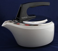
The first plastic kettle, the Futura gives us a vision of the future, pre-empting Zaha Hadid and using new technologies to achieve new levels of showiness. This was the beginnings not of academic postmodernism, but of marketing and obsolescence driven futurism that still comes and goes, trying to inspire consumers today. They weren't convinced this time though, plastic discoloration and other functional problems, when compared to the still-popular and reliable K2, meant that the Futura was discontinued in 1979. Russell Hobbs themselves even disowned the idea in favour of the older K2:


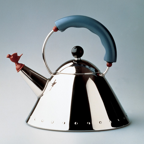
The Alessi agenda came to it's full fruition in the mid 80's at the height of the postmodern revolution, with the introduction of the 9093 stove kettle by postmodern architect Michael Graves:


A more seminal work of postmodern industrial design is impossible to find, the 'Michael Graves Kettle' has come to iconify Alessi, Postmodernism, and Industrial design itself. Designed to look 'American', it does much more than that, and instead of using the naive but forward-thinking imagery that we have seen over the last 90 years, it references the past, looking to bring forward nostalgic memories, a simulacrum of an America that never existed, but coming with it's bright colours and witty, entertaining, noisy whole, one we wish did. It has since been a best seller, including it's less sincere but more practical electrical brother, the MG32.

Back in the real world, the plastic revolution really came to the fore in the 1980's with the introduction of the familiar 'jug' kettle.


Easy online information on these products is thin on the ground, as they are barely elevated to the level of 'classics' yet. I'd be better asking my parents if they could remember any of the 80's, but from the above Morphy Richards and the following Haden Autojug;


We can see that the kettle has clearly taken most of it's current form, including the exact 1.7 litre capacity, use of white Polypropolene and vertical stance. Looking further at the very controls of the Haden Autojug, and considering that Strix introduced the universal P7 series of controllers in 1985;


We can see that the standard kettle design we currently know and love has been wholly delivered by the mid 80's. Notice how these designs have scrapped the futurism of the late 70's, and the bleeding-edge trend of postmodernism, despite that academically we are told that modernism died at this exact time. This, perhaps, teaches us that when introducing new forms and technologies, as Peter Behrens did in 1909, that functional, non-confusing, 'black box' design is, and always will be, the best way to present.


Which takes us to where we are now, summed up by the Russell Hobs Montana introduced at the turn of the millennium. Claimed as a bestseller by RH themselves, and i've seen one in my Grandma's house, we are now at the millenial stage where we are rejecting and accepting both the slick, uncompromising world of chrome-and-black modernism, and the whimsical, traditional approach of the postmodernists. In terms of functional developments, the average kettle has grown a separate 360 degree base, a clear benefit to the user, and one driven by the controller manufacturers Strix and Otter themselves, the real heroes of today's kettle design. 

This study has taken us, via the design of the unassuming common electric kettle, through a full tour of the whims and the waves of the last century-and-a-half of product design itself. It is 17 years since the Montana, and despite existing 'executive' designs that helpfully offer to complicate our morning brew, we are left with not much of relevance that we can anticipate trickling down to the basic market. Current design is identified more by it's variety than anything else, enabled not by a new physical technological revolution; but by Personalisation, Globalisation of trade, and Interconnectivity; a new army of Chinese-built, functionally identical kettles in whatever style we believe best furnishes our kitchen, at whatever price we are willing to pay.


08 June 2017

Kettle 02 - Teardown

Kettle Project : The Market  Teardown  History  Aesthetics  Process  Concepts  Costing  Induction


Now that we have assessed the market and performance aspects of the kettle, we need a real understanding of how the machine works. The way we do this in PDE is to tear the product down and  grapple with all the small internal parts. This means we can picture it not as it's iconic, oversimplified exterior, but with the realities of how it is put together.


In most projects, taking apart a product is a good way to think about what has come before, as well as reminding oneself about the tricky intricacies of real products in general. Here, it is even more important I'm looking to design an efficient, low cost and 'current' product.

So without further ado, let's get stuck in.

The Teardown


My teardown begins at the base, which has only one removable peice, the cover for the electronic connector. Notice how it only uses two screws, a solid connection would commonly require at least three, but here the other side of the connection has been cheaply snap fit.


And here the connector is, a Strix P69 connector, probably common to most fixed-position cordless kettles. It has a clever sprung door which is first dragged by the middle earth prong, exposing the live connectors.


And beides a few rubber feet, that's it for the base. In use, it tends to flail around a bit due to it's lightweight-ness under the influence of the stiff cord and the heavy kettle, but it's a very economical use of materials, with one complex piece doing all the jobs it can.


On to the main body of the kettle, our first priority is to remove the external screws and separate the two parts of plastic that make up the whole body.


This can be done by removing just four phillips screws, two at the top, and two at the base.


This separates the two main parts of the kettle. Lid & handle are connected, and the main controller is mounted onto the body.


The lid is mounted with rather shaky looking snap-fit joints which are very loose to movement. Also, given that they are composed of rather soft Polypropelene, I can't see them standing up to too many cycles of removal and re-attachment. Not that that is a priority.

Flipping the main body round, we can get to the brains of the machine.


And there it is, the Strix R7 controller. Released in 1985, the strix R-series has been the backbone of of most simple kettles for more than a generation. Strix currently have a 60% market share of the global kettle control market, and work with Beko, Braun, Bosch, Breville, DeLonghi, Kenwood... and nearly every other kettle brand you've heard of.


What's interesting is that this is literally the entire functional heart of the device. It connects directly to the switch, element and connector. You can also, for even further simplicity, connect it directly to a three-hole 'kettle plug', and do away with the base.


The switch is simply detached, and loosely houses the lamp and a sealed-in resistor.


Removing three screws is the last real job to do. The above screw was the third, and due to a small metal ring, and it's connection to the electronics, it was rather a lot harder to remove than the other three.


A large red sealing ring is exposed, and the element falls into the body.


The element and the controller connect in a very specific manner, the three screw holes going through the controller, and an assortment of connections, copper strips and pushrods form an interface.


The inside face of the element has a large copper strip and a small blob of thermal grease. My first assumption was that this strip was a bimetal that would be bending to thermally control the device.


And that's basically it as far as de-construction is concerned. In fact, for most practical industrial design purposes, this is as far as you need to go. Once these four (five if you include the switch) plastic pieces are specified according to the brand's needs, the only thing left is to source the element from outside, with the only requirement being that is is compatible with the famous Strix controller.

Clearly the plastic parts have constraints of their own, not least the correct fitting with the control components, but also they need to be produced in accordance with the right production processes.

Production Processes

The production process we are going to mainly consider is injection moulding. All of the 6 'designable' parts of this product have been injection moulded, and all of the 4 main parts are white Polypropylene. Polypropylene is the obvious choice for a kettle as it is very easy to mould, and fairly resistant (if a bit soft) in practical use. More importantly however, is ready available in food-safe variants.

Our investigation of injection moulding is going to develop by looking at the various main parts in increasing order of complexity. This isn't an explanation from the manufacturer, however, just my best guess at how it would be made. First, we look at the base, which is a very basic bit of moulding.


It is easy to work out how this has been moulded, and is in fact a perfect example of a simple two-plate mould. Helpfully, the join between the two moulds is both planar, and situated right at the bottom of the part, meaning an unsightly join line is avoided. One thing to note is the small bumps on the upper face. These are above the long holes on the underface (see earlier in this post), and are intended to avoid even more unsightly sink marks that would appear at these areas of complexity.


The lid seemed to me like another example of a simple two plate mould, but in fact there is a little ridge on the underside of the lip which goes against the main direction of split. This can be dealt with in some cases by a diagonal slide-out or ejection pin which facilitates this fairly necessary feature. Also note the ribs that circle the outer ridge, these reinforce the thin inner lip from shrinkage in the mould, and also are the main point of contact with the body when in position.

The next part, the handle, seemed at first glance to be another easy example of a two-part mould, but on further inspection, it's lower part had an array of features that were aligned perpendicular to the regular split direction.


Add to this that the bottom is a feature that must necessarily be flat and not produced with a draft angle, and a conspicuous join line around the bottom, it led to the theory that there must be a third proper 'slide-out' component to the mould.


More troubling is the overlap at the top, which includes many perpendicularly aligned features. This is likely done with another diagonal slide out , as indicated by the slightly diagonal orientation of all of the walls in this area.


The most complex part of the product however, unsurprisingly, is the main body.


What is semi-obvous is that the kettle tapers from top to bottom, which is a clear example of a macro- draft angle across the whole product, which helps with easy release from the mould, but is also a subtle influence on the aesthetics of the machine. Don't trust square sided plastic products! 


This then gives us our general direction of split, but what troubled me the most was how the geometry of the handle , which clearly faces outward in completely the wrong direction. I attempted to map out my ideas spatially by using felt-tip to indicate the various parting lines and edges, but i was having trouble until some internet-sleuthing on alibaba led me to this image form a company producing moulds for water jugs.


Clearly this is very similar to the way the kettle is made too, with a bit of complexity. The final step was realising that the handle wasn't moulded by a part perpendicular to the main split, but as a product of both the top and bottom pieces.


Only a product of very high cost, or one produced in astronomical numbers can justify such a complex mould. I think we know which one this is, especially when it's cousins crop up on amazon -at three times the price I paid! ;) 


So we have made a stab at how it's made, the next question is: how does it work? For that we have to investigate the electronics.

Electronic Control

The electronic control, as mentioned previously is exclusively how this kettle works. In order to investigate the exact details, we will have to have a look back at the R7 controller.


On the element-side of this device, there are three 'inputs'; at the top, a stripy bimetallic sensor, then, at the bottom, a white pushrod and a purply-colored bimetallic sensor.


From the side it is possible to see the relation between back and front, and also at the mechanism that connects the upper bimetal to the mechanical switch, and from there into the central body. The upper bimetal then, is clearly the sensor that ordinarily turns the kettle off when it is ready.


It does this by being exposed to hot steam which comes down from the top of the kettle via a 'steam pipe'. In more expensive kettles this is an actual pipe, but conveniently, here is just another peice of plastic. It is interesting that the rest of the device is not protected from steam ingress, as there is indirect contact with the steam from the kettle, although this must just be a symbol of the bimetal's consistency in detecting hot steam.


The other two devices we have to work out are the cutoffs. These work to prevent a dry-boil - where the kettle is turned on without water. They do this by turning the circuit off when the element gets unreasonably hot - a sure sign that the heat energy is not being passed on. From the outside, we can see the two pins which go into the controller to perform this action, and we know from the website and other sources that the controller actually has two cutoffs as extra security.


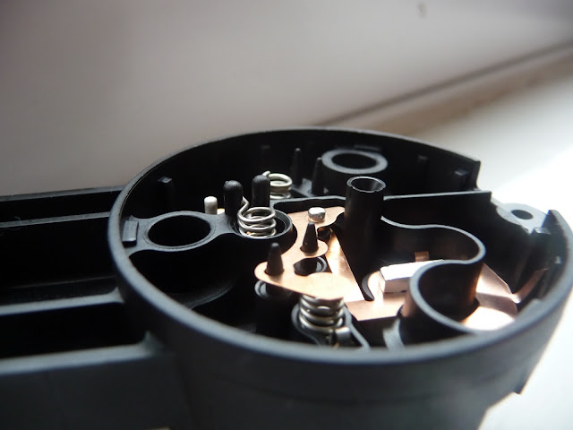
To investigate further, we are required to pop open the controller to see inside. The controller itself is made of just two pieces of injection moulded Polyamide (Nylon), and inside is an intricate network of   flat, stamped copper pieces which are both the conductors and the switches of the internal circuit.

The location and working principle of the first cutoff (the one with the blue pushrod and the purple bimetal) is fairly clear.


When the bimetallic sensor 'clicks' into position, the blue pushrod cuts the circuit. This is the case until the bimetal clicks back, which it does once it's cooled down. This is a safe practice that prevents the kettle melting itself, and helpfully, it does re-set, so we can use the kettle safely after a few minutes of our mistake.

The other cutoff is harder to work out. Especially as several bits of the circuit fell out upon opening it.


The bit of the circuit in question is that on the side of the neutral pin.


Here, 'cutoff 2' is linked by a spring to the circuit, this connection is also located in close proximity to the mechanical 'input' from the user's switch. When the controller is sandwiched between an 'on' switch and the element, this will always be closed. Which means what I assumed was a bimetallic strip (on the back of the element) has no use in breaking the circuit.

Doing some further testing, and finding Strix's own patent EP 0255347 B1, which described:


"A thermally-responsive control comprising a bimetal for initiating a control action in response to a predetermined over-temperature situation, a thermally collapsible element for initiating a control action in response to an extended overtemperature condition" 

revealed the solution:


What we have is a three stage cutoff mechanism, each with a decreasing degree of 'forgiveness':


The first bimetal to snap is the usual steam sensor, which goes off once it meets steam at 100 degrees C, or thereabouts.

Failing that, or when boiling dry and the element overheats, the purple bimetal, 'cutoff 1' on the controller snaps and stops the circuit, and re-sets once it's cooled down, which can be done simply by re-immersing the element in water.

In a disaster situation where 'cutoff 1' has failed for some reason, the small yellowish pin will melt, where it has strategically been made very thin, this will release the spring and deactivate the circuit on the neutral side. This will irrecoverably damage the kettle, but at least your house is kept safe.


So there you go; that is, roughly, how a kettle works and is made. Now I have a decent understanding of what is is I am to design, the next stage is probably to get an understanding of what 'good design' means from a kettle's perspective, which may come in the next post in this series. Stay tuned!