One must begin an analysis of Postmodernist architecture with that important work, Complexity and Contradiction in Architecture, written by Robert Venturi in 1962. In the book, he argues against the boring, formulaic architecture of modernism, particularly that most boring architecture of the 40's and 50's, which by then had adopted modernist thought as the rule that should not be broken. This either resulted in typical international style office buildings and flats, or in obnoxiously reductive star-chitecture from the likes of Mies Van Der Rohe and Phillip Johnson.
The main source of his argument, which is in favour of the difficult whole and a gentle symbolism, is found in the complex, variegated and often confused architecture which makes up the streetscape of classical cities, most prominently Rome. Having said that, in the book he often praises the work of many of his contemporaries, notably the PSFS building in Philadelphia and the works of Louis Kahn, who, while modern, accepted an overall symbolism as a core part of his work.
The book was described by Vincent Scully, in the introduction to the second edition (1977), as a "brilliant, liberating book". This is because what it did was shift the focus of architecture from an anal and ideological pursuit towards pure, cartesian 'functionalism' into the wider realm of symbolic meaning and social effect. The impacts of this shift can just as well be seen in the subsequent movements of late-modernism, which focused on much more symbolic and retinal values which promoted modernist thought, as it can be seen in Post Modernism, which went beyond this gentle manifesto to systematically reject the firmly held modernist principles. I will therefore aim to categorise and explain various movements in Post Modernism as specific and exact rejections of certain modernist dogmas.
Similarly, the Capitello Chair takes an architectural icon and ironically re-introduces it as a soft piece of furniture.
Modernism 'destroyed' this, and despite the fact that popular retinal styles such as arts and crafts, art deco and streamline moderne persisted though the time of the International style, extraneous non-functional detail wasn't really considered a necessary part of academic architecture for a long while.
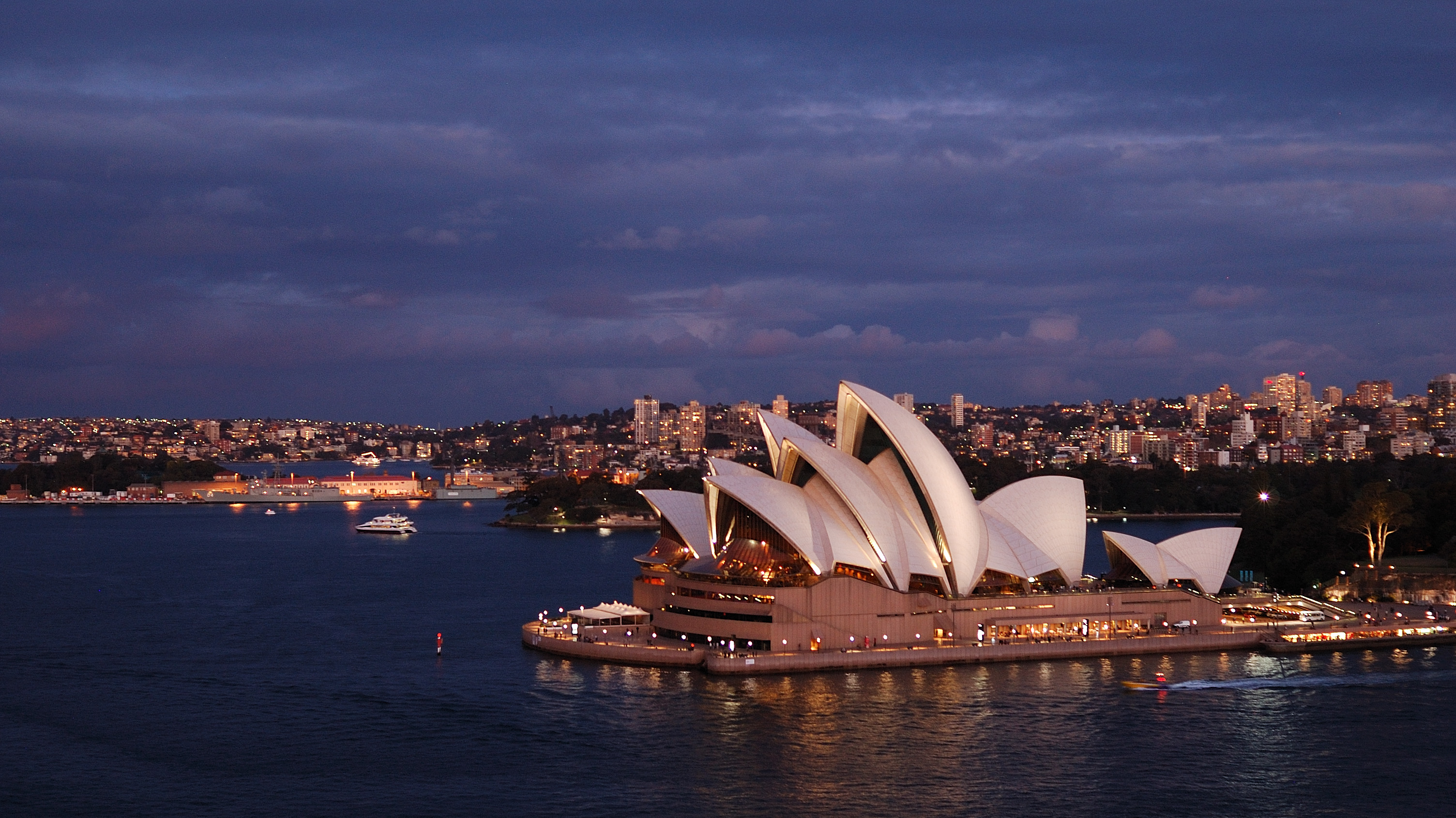
Post-war, things started to slowly move towards symbolism, which can be seen in the architecture of Louis Kahn, who introduced 'useless' geometric details into his work, and most famously in the Sydney opera house which introduced frivolous, needlessly expensive 'sails' over the top of a concert space that was less than useful in the first place.
These functionless (but not necessarily anti-function) extravagant conceptual pieces of architecture became icons. The market for architecture wanted expressive icons, and the only barriers in the way of architecture to providing these icons were those of a strict, reductionist methodology. These were soon torn down once a new generation of architects got a sniff for 'exciting' competitions and large public purses.
Now any second-rate city (that includes you, Glasgow!) could buy an off-the-shelf, maximalist architectural 'icon'. Perhaps it makes sense to include a fancy footbridge in the scheme too! Why Not?
The market forces behind this can't be ignored, Cities, Governments, Dictators and Architects all were desperate for statement pieces that would place them on the forefront of some imaginary line of progress. Wether or not these lucrative buildings were "influenced by the French philosopher Jacques Derrida" or not, is beyond the scope of this superficial study, but perhaps It does deserve a later 'serious' study.
More than any style before however, this asks serious questions about the final goal, implementation. These grand aesthetic projects, after 30 years, are still, in their own terms, cerebral studies in form and space. That these projects 'deconstruct' established values of what architecture and design should be, can't be questioned. But perhaps these projects separate themselves from realistic study, in the same way that modernism did, and this intellectual separatism means they are immune to criticism in that respect.
Now, Mies and Corbusier did make dramatic and sometimes random architecture, but they were at the forefront of both glass and steel and concrete. These have since (despite or otherwise) seen implementation worldwide as cheap and efficient construction methods, despite the problems that they had as 'avant-garde' architects (leaks, costs, and the like). Wether this dramatic and ostentatious aesthetic has something to offer to 'the people' is to be questioned, but the pretence is that they are 'aestheticising' new production themes and methods, as the modernists did. But it is not going to be any time soon that the industrial parks and social housing schemes of the world adopt a "complex variegated spatial order" as the simple and cheap rule of thumb.
The dramatic Shonandai Cultural Centre , celebrated as an example of the future in Architecture for the Future is now almost on the cusp of becoming a historical relic, 20 years since it's construction. We see modernist housing, for better or for worse, all around, and still today. What does separation from the cartesian grid, emotional or otherwise, really have to offer? Despite it's erogenous use of CAD and parametric design, it is yet to be taken on by all but the richest of governments, or billionaires.
4)
The main source of his argument, which is in favour of the difficult whole and a gentle symbolism, is found in the complex, variegated and often confused architecture which makes up the streetscape of classical cities, most prominently Rome. Having said that, in the book he often praises the work of many of his contemporaries, notably the PSFS building in Philadelphia and the works of Louis Kahn, who, while modern, accepted an overall symbolism as a core part of his work.
The book was described by Vincent Scully, in the introduction to the second edition (1977), as a "brilliant, liberating book". This is because what it did was shift the focus of architecture from an anal and ideological pursuit towards pure, cartesian 'functionalism' into the wider realm of symbolic meaning and social effect. The impacts of this shift can just as well be seen in the subsequent movements of late-modernism, which focused on much more symbolic and retinal values which promoted modernist thought, as it can be seen in Post Modernism, which went beyond this gentle manifesto to systematically reject the firmly held modernist principles. I will therefore aim to categorise and explain various movements in Post Modernism as specific and exact rejections of certain modernist dogmas.
1) Rules are rules Break the rules
Modernism came with a lot of rules, the height of the style was specifically defined in The International Style, and various other dogmas. Venturi instead had an affection for both traditional and classical styles, in terms of classical, those of Mannerism, Baroque and Roccoco, which found in their spirit-of-the-times a passionate subversion of more established Virtuvian classical orders.
His rejection of the modernist dogma came via the means of pitched roofs, added ornament and and a cluttered interior form derived from the mass of the building. This is in direct contradiction to the rules of the international style established by the great mover Phillip Johnson in the International Style.
Johnson himself, famously, rejected his own modernist style in his AT&T building of 1984.
It wasn't as simple as adding pitched roofs to otherwise modernist buildings however, you see, Le Corbusier himself began his editorial affections by declaring his love for the Parthenon (which at the time was definitely not believed to be painted in expressive colour) as an example of rigorous, mathematical, proportional and ultimately perfect design. The Parthenon was, and continues to be, a standard model for building, It's 8-column facia and plain doric columns an example of the timelessness of classical western architecture, in both style and material.
Me and the Parthenon
While postmodernism reacted to the tyranny and constraint implied by the modernists, certain movements also recognised that the same restriction had been enforced by the academic architecture of the neo-classical and gothic revival projects that preceded it. Therefore, their goal was to subvert both by using both vernacular and traditional-esque forms in a completely new and uncontrolled manner.
On the one hand, it did this by re-interpreting classical forms and using them on modern building forms to create an entirely new an unpredictable system of anti-proportions.
On the one hand, it did this by re-interpreting classical forms and using them on modern building forms to create an entirely new an unpredictable system of anti-proportions.
Ricardo Bofill's Les Espaces D’abraxas
We can see these rejections and re-hashes in postmodern product design too, the Proust Chair by Alessandro Mendini takes a historic form and re-introduces it with a garish pattern.
Proust Chair, Alessandro Mendini, 1978
Similarly, the Capitello Chair takes an architectural icon and ironically re-introduces it as a soft piece of furniture.
Capitello Chair, Studio 65, 1972
This rejection of academic tradition is less of an easy pursuit in product design however, because unlike architecture, industrial design up to this point had almost been synonymous with modernism; Industrial design began with the Thonets of the world and has therefore been intrinsically linked to simple mass production. It is especially hard to mix up traditional forms in products that have only existed since mass production, or were once only considered tools.
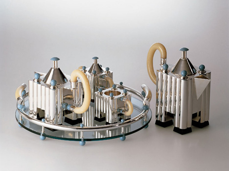
One way of getting round this problem, and present a product design as a traditional re-hash is to elevate it's scale to that of architecture, where the ironic references become easier. This is how Michael Graves introduced his first set of kitchenware for Alessi.
While there is a certain merit, and a low-brow 'power to the people' charm to this kind of design, it was still nearly always a middle-class cultural pursuit, and in any case, once the shock of the rejection of plain-white modernism had sunk in, it quickly died as a relevant style. It can be seen today in the wonky roofs and half-arsed colour blocks of any late 80's or 90's dockside development, but the grand cerebral anti-modern movement did little to influence common tastes. (arguably the 'common taste' had only just moved onto modernism in 1996 with the 'chuck out your chintz' IKEA advertisement)
One way of getting round this problem, and present a product design as a traditional re-hash is to elevate it's scale to that of architecture, where the ironic references become easier. This is how Michael Graves introduced his first set of kitchenware for Alessi.
Silver tea and coffee set by Michael Graves for Alessi
While there is a certain merit, and a low-brow 'power to the people' charm to this kind of design, it was still nearly always a middle-class cultural pursuit, and in any case, once the shock of the rejection of plain-white modernism had sunk in, it quickly died as a relevant style. It can be seen today in the wonky roofs and half-arsed colour blocks of any late 80's or 90's dockside development, but the grand cerebral anti-modern movement did little to influence common tastes. (arguably the 'common taste' had only just moved onto modernism in 1996 with the 'chuck out your chintz' IKEA advertisement)
Beyond this argument, Exploding The Myths of Modern Architecture explains that the core point of modernism was "to be shocking", highlighting Duchamp's toilet as an example from the world of art, reflecting the shocking pace of change in the industrial and technological worlds at the turn of the century. In this sense, this strain of postmodern architecture has actually failed to really grasp and counteract the tide of modernism, as it still fundamentally observes the concepts of 'now', 'new', and 'next' as if these are things to appreciate.
2) Form follows function What function?
When given the post complexity-and-contradiction freedom to freely symbolise, the late modernists chose to use this to represent the same old modernist, progressive views, albeit in an exaggerated, retinal sense. What certain postmodern forms did was to reject the idea of functionalism altogether.
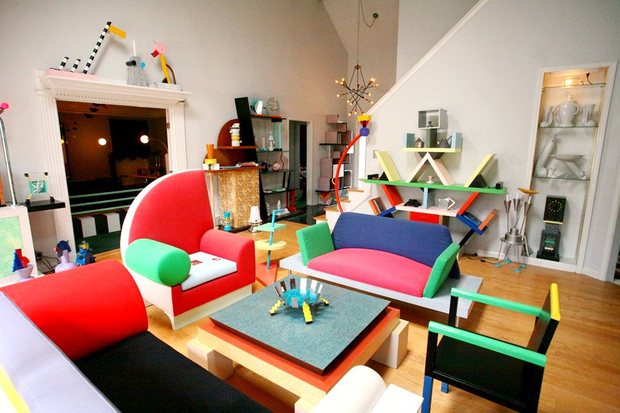
The memphis design movement is the easy example in this case. In many examples, Sotsass and his crew rejected the functional, volumetric efficiency of modernist design in favour of expressive shapes. These projects are worse in every measurable sense of the term, but in the time would have had a radical, revolutionary fervour.
We can see the Valentine Typewriter is Sotsass still contained in by 'proper' product design, emotional but still constrained by function, in this sense, despite the touch of emotion, it is strictly late-modern and shares more in common with designs by Dieter Rams and Richard Sapper.
Then, once the eighties and a loftier, looser self-initiated brief came around, surrounded by his memphis colleagues, he was truly free to reject function and sense - the result was a wide range of showy, colourful furniture.
Now I'm not ready to suggest with such clarity, as Deyan Sujic does in The Language of Things, that artistic value and functionality are inversely proportional, but what the memphis designs 'gained' in their shedding of the 10 Principles is a higher degree of expressive potential. They in turn used this expressive potential to challenge the idea of function itself.
Stronger rejections of function, that go beyond aesthetic realisation and into actually consciously making products more difficult to use can be seen thereafter.
David Carson's design for RAY GUN magazine comes to mind, where the grunge typography took an extra step by setting an entire article in dingbats.
The Reversible Destiny Architecture, by Arakawa and Madeline Gins, makes an excessive point about being hard to use. In their own, lofty, words:
In the late-modernism post that preceded this one, a tenuous link was almost made between late modernist structural expressionism and the parametric architecture of architects like Zaha Hadid. What we must recognise in this teardown however, is the difference between what designers say motivates them, and what really does. At face value, Schumacher of ZHA presents 'logical' arguments for the need for and the power of computationally aided parametric design. At the same time he is a practitioner of a purely aesthetic pursuit, one that was originally termed 'de-constructivism'.
The intuitive, expressive process has always been a component of architecture, in fact it is probably a more definite component of architecture than the mystic functionalist logic that the modernists applied to the word.
We can see the Valentine Typewriter is Sotsass still contained in by 'proper' product design, emotional but still constrained by function, in this sense, despite the touch of emotion, it is strictly late-modern and shares more in common with designs by Dieter Rams and Richard Sapper.
Ettore Sottsass, Olivetti Valentine typewriter, 1969
Then, once the eighties and a loftier, looser self-initiated brief came around, surrounded by his memphis colleagues, he was truly free to reject function and sense - the result was a wide range of showy, colourful furniture.
Ettore Sottsass, Carlton bookcase, 1981
Now I'm not ready to suggest with such clarity, as Deyan Sujic does in The Language of Things, that artistic value and functionality are inversely proportional, but what the memphis designs 'gained' in their shedding of the 10 Principles is a higher degree of expressive potential. They in turn used this expressive potential to challenge the idea of function itself.
What these designs do, in their rejection of dubiously derived functional ideals, is in some way give the user more freedom; the asymmetric, illogical, non-prescriptive shapes do not treat the user like a formula, fully accepting that products aren't used as they 'should' be.
Stronger rejections of function, that go beyond aesthetic realisation and into actually consciously making products more difficult to use can be seen thereafter.
David Carson's design for RAY GUN magazine comes to mind, where the grunge typography took an extra step by setting an entire article in dingbats.
The Reversible Destiny Architecture, by Arakawa and Madeline Gins, makes an excessive point about being hard to use. In their own, lofty, words:
Arakawa and Gins designated Biocleave House as an "inter-active laboratory of everyday life” whose terrain and walls are deliberately realized in unexpected ways to keep a person ‘tentative’ so that they must actively negotiate even the simplest tasks. This heightened body awareness and the challenging of senses can, they believed, allow the body to constantly re-configure itself and with time become a means to strengthen the immune system*. Bioscleave House fundamentally proposes an architecture of viability that helps to sustain one throughout life, and even extend human lifespan indefinitely.
Long claims, but this is definitely the opposite impulse to that which designed places like Preston Bus station with definite, prescribed, calculated passenger and vehicle flow corridors, which ended up undoing their original intentions through the inaccuracies in their ideological social models.
2) Less is more More and more
In the late-modernism post that preceded this one, a tenuous link was almost made between late modernist structural expressionism and the parametric architecture of architects like Zaha Hadid. What we must recognise in this teardown however, is the difference between what designers say motivates them, and what really does. At face value, Schumacher of ZHA presents 'logical' arguments for the need for and the power of computationally aided parametric design. At the same time he is a practitioner of a purely aesthetic pursuit, one that was originally termed 'de-constructivism'.The intuitive, expressive process has always been a component of architecture, in fact it is probably a more definite component of architecture than the mystic functionalist logic that the modernists applied to the word.
Modernism 'destroyed' this, and despite the fact that popular retinal styles such as arts and crafts, art deco and streamline moderne persisted though the time of the International style, extraneous non-functional detail wasn't really considered a necessary part of academic architecture for a long while.
Jatiya Sangsad Bhaban, Bangladesh, 1961-1982, Louis Kahn
Post-war, things started to slowly move towards symbolism, which can be seen in the architecture of Louis Kahn, who introduced 'useless' geometric details into his work, and most famously in the Sydney opera house which introduced frivolous, needlessly expensive 'sails' over the top of a concert space that was less than useful in the first place.
Frank Gehry - Guggenheim Bilbao, Walt Disney Concert Hall LA; Zaha Hadid - MAXXI Rome, Riverside Glasgow; Norman Foster - Sage Gateshead; Daniel Libeskind - ROM Ontario, Imperial War Museum Salford; Coop Himmelb(l)au - Musee des Confluences Lyon, International Conference Center Dallan.
Now any second-rate city (that includes you, Glasgow!) could buy an off-the-shelf, maximalist architectural 'icon'. Perhaps it makes sense to include a fancy footbridge in the scheme too! Why Not?
The market forces behind this can't be ignored, Cities, Governments, Dictators and Architects all were desperate for statement pieces that would place them on the forefront of some imaginary line of progress. Wether or not these lucrative buildings were "influenced by the French philosopher Jacques Derrida" or not, is beyond the scope of this superficial study, but perhaps It does deserve a later 'serious' study.
More than any style before however, this asks serious questions about the final goal, implementation. These grand aesthetic projects, after 30 years, are still, in their own terms, cerebral studies in form and space. That these projects 'deconstruct' established values of what architecture and design should be, can't be questioned. But perhaps these projects separate themselves from realistic study, in the same way that modernism did, and this intellectual separatism means they are immune to criticism in that respect.
“THESIS 8: The avant-garde segment of architecture functions as the subsystem within the autopoiesis of architecture that takes on the necessary task of architectural research by converting both architectural commissions and educational institutions into substitute vehicles of research.”
-Patrik Schumacher
Now, Mies and Corbusier did make dramatic and sometimes random architecture, but they were at the forefront of both glass and steel and concrete. These have since (despite or otherwise) seen implementation worldwide as cheap and efficient construction methods, despite the problems that they had as 'avant-garde' architects (leaks, costs, and the like). Wether this dramatic and ostentatious aesthetic has something to offer to 'the people' is to be questioned, but the pretence is that they are 'aestheticising' new production themes and methods, as the modernists did. But it is not going to be any time soon that the industrial parks and social housing schemes of the world adopt a "complex variegated spatial order" as the simple and cheap rule of thumb.
The dramatic Shonandai Cultural Centre , celebrated as an example of the future in Architecture for the Future is now almost on the cusp of becoming a historical relic, 20 years since it's construction. We see modernist housing, for better or for worse, all around, and still today. What does separation from the cartesian grid, emotional or otherwise, really have to offer? Despite it's erogenous use of CAD and parametric design, it is yet to be taken on by all but the richest of governments, or billionaires.
4) The future is bright The past was great
“I am an architect, because I don’t build”
-Leon Krier
If the cult of egotistical architecture itself is the problem, then what is the solution? The consensus of the 'people' (although i'm not sure it has been researched properly) is that people generally like the traditional european cityscape.
So why not just regurgitate that again?
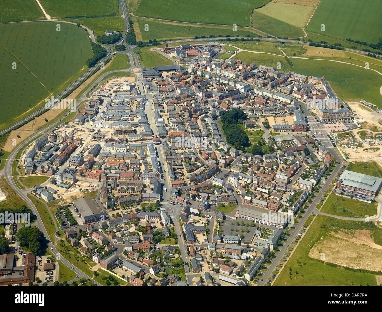
Since the 1980's, there has been a resurgence in 'neo-traditionalism', often, especially in Britain, attributed to His Royal Highness the Prince of Wales, who has authored (or at least authorised) several developments, including the famous Poundbury, but also Fairford Leys, et cetera.
Such design, collected under the 'New Urbanism' umbrella, is much the opposite of 'new', as it attempts to re-find the spirit of traditional townscapes, as if the lack of community in other new towns such as Milton Keynes, Chandigarh, and, um, the whole of the USA, can be attributed to the downfalls of modernist (or at least pseudo-logical) thought.
Masterplan for Chandigarh
Such townscapes, designed and planned by the likes of Leon Krier and Quinlan Terry advocate not just random-esque, carefully formed, streetscapes and urban planning, but also a return to a variety of 'past' styles, including Neo-Classicalism, Vernacular and Arts and Crafts. The central idea is that modernist cities give way far too much to modern car traffic, a function of their naive belief in modern technology, and the real solution lies in close, walkable townscapes. But can one just 'make up' an organic town layout?
The movement is not just particular to the UK, the same can perhaps be seen in neo-traditionalist movements in Germany, mostly in Berlin by architects such as Sebastian Treese, Tobias Nöfer and Petra and Paul Kahlfeldt
I really, really, want to go to Poundbury to scope this whole scene out. But I have been to the modernist Chandigarh, and I can attest to the fact that Corbusier's city of dreams is both highly understandable and functional, but also very un-human, at least compared to the rest of India and the world. The centres of London, Prague and Athens are randomly and accidentally non-panned, but they do have a certain 'energy' and 'community' that modernist developments have failed to yet fully realise. However, Paris, New Edinburgh, Barcelona and Glasgow, which were all planned have also re-claimed a certain culture, so it seems that the real answer is that 'planning' is not the mistake, being wrong is.
Visually, and according to a guy at the pub (who is an architect) this resurgence in Arts and Crafts aims to give back freedom to the building contractors to produce period details upon new buildings. This sounds like a brilliant idea, if the problem is, as postulated in the introduction to this section, that architecture itself is the problem. This brings back the massive existential problem that has existed since the 1850's for all designers and architects of any kind, however, that of the role of the architect or designer in the system as a whole.
On the one hand, engineers and scientists are the best placed to solve our problems, and the best 'Designers' can do is to guide those technicians through the route to do it 'properly'. This results in, hopefully, 'high tech' design, or at least a design which is functionally and/or structurally sound. But the inevitable result of this is that those late modernist designers such as were at Vitsoe or Braun or LAMY have found themselves 'Engineered out' of the situation.
Similarly, If the main goal of architecture is to let the Prince to allot visual rules to the property developers on his own accord, and to have the result delivered by 'low-end' builders and traditional craftsman, then the architect finds himself with little to do, besides suggest the general volume of the building. The 'big-D' designer finds themselves 'crafted out' of the situation. This is nowhere near a bad suggestion, but it becomes a very hard argument for an egotistical architect or designer to suggest they they themselves are the problem.
Another problem with this method of thought, which comes to a point in Exploding the Myths of Modern Architecture's suggestion that the in-between architecture of Frank Lloyd Wright, Mackintosh, Loos, Eliel Saarinen or Art-Deco in general is the most forward-thinking, or at least most 'appropriate' architecture we can find, is both backwards and a logical Argument to moderation fallacy. These have been since discounted as both more expensive that the real 'functional' architecture of industrial chicken-factories, and less marketable than the vague, sloppy but quaint architecture used by the massive housing developers like Taylor-Whimpey.
Another problem with this method of thought, which comes to a point in Exploding the Myths of Modern Architecture's suggestion that the in-between architecture of Frank Lloyd Wright, Mackintosh, Loos, Eliel Saarinen or Art-Deco in general is the most forward-thinking, or at least most 'appropriate' architecture we can find, is both backwards and a logical Argument to moderation fallacy. These have been since discounted as both more expensive that the real 'functional' architecture of industrial chicken-factories, and less marketable than the vague, sloppy but quaint architecture used by the massive housing developers like Taylor-Whimpey.
***
So the post-modern thought train did a lot to dispel the myths of what modernism had made out architecture and design to be. Now, apparently design didn't need to try, or at least pretend, to be functional. This made design realise it's expressive potential, but due to the high costs involved, especially in architecture, this expression failed to affect building in the 'real world'.
If design isn't just constrained to the middle-class bubble, then a study of what the 'real world' really engaged with may be more pertinent than the before cerebral discussion of 'design icons' that took three very long blog posts. This is hard to achieve because contemporary readings on past design focus on the 'canon' of design. Perhaps the design community better interact properly with antique collectors, art and craft resurgents and the like.
There is also the question of wether the contemporary strain of 'clever' architects such as Rem Koolhaas and BIG represent a new movement in real design, or are just another ripple in the familiar sphere of architectural discourse. Does anything need to change? Designers may yet argue and design themselves out of the picture, and that may be the best situation the world could put itself in. Or maybe 'Design' is the only quality that gives products and building a real, positive meaning.
*This concept of more challenging, naturalistic, conditions having a positive effect on the immune system has come back round into modernism, with Vitsoe's new highly funtional building "we will be warmer in summer, cooler in winter, and exposed to daylight because no lights are on during daylight hours" https://www.vitsoe.com/gb/voice/arrival


