tom lever blog

12 July 2016

terry


Meet terry.


"A device and system that slices your food bill, cuts your food waste and intelligently plans your meals. He caters for fussy eaters, a strict diet and the lazy cook. terry’s system is based around a control panel with a receipt scanner, which can be used independently or enhanced with the use of Wi-Fi, an app and a website."


terry was a response to the Waste Not Want Not brief set by RSA. The project was set by our school, and I worked on it as part of 'team hotdog', the brief challenges it's subjects to design a way to reduce food waste in society. 

Our new product involved the introduction of an 'Internet of Things' device, who's main function was to scan food receipts, and remind users when food was due to be out of date. It incorporated a strong 'emotional design' element, as the device would become upset as your food went out of date. Out of this, to solve micro-problems, and to get more function out of the basic technology, there evolved a wide, wide range of features and neat-ish solutions including: communication via instant messaging with the terry system, local competitions, meal planning for the whole family, sharing leftovers with local strangers, price comparing local supermarkets, calorie counting, cloud sharing recipes with freinds ... and more.


In order to contain this sprawl of features, we produced an array of diagrams showing how the system would work and be organised;


User Services

System Diagram

And the 'touchpoints' of the service design system were quite carefully designed,  I would argue that the industrial design of  the main physical product is both neutrual, clever, and confident; the capacitive, clicky bezel is the control surface - similar technology to the apple magic mouse - and aims to keep greasy fingers off the screen.


A lot of work went into containing the sprawl of features into a manageable interface - again quite good visually, and makes some sense when you get into it.


However, despite a very good work ethic from the team, large amounts of research, brainstorming, decent graphic design, product design iteration, technical explanation, and prototyping, the project got nowhere. We neither achieved a particularly good grade, nor processed in any way in the RSA competition.

After time to reflect on why, the answer becomes clear. terry was a Complex Solution to a Complex Problem. Our efforts have merely transformed the problem of food waste itself into a product that lis likely to be a christmas one-hit-wonder - and likely become a big product waste problem. We have also turned the difficulty of managing food waste in the home into the difficulty of maintaining control over a large app ecosystem. I think there is a very low chance of this product gaining many 100% committed users.

I am still a student though, so I can learn some important things from the fact that this project went the wrong way.

Less is more, especially when proposing a new idea, or launching a new product. In 'solving' many small issues with new functions, the product lost a core focus, and instead of presenting one simple, clever and refined idea, the product became a mess of slightly interesting ideas. For a good example of this done the right way, we can look at the first iPhone.


It was initially presented, launched, and sold with hardly any features, in fact, it was a step back in many respects from other phones on the market. It had no 3G, a tiny camera, no video, and none of the app store excitement it is known for today. What it did do though was sell a specific few features - browsing, music and multi touch - in such a way that it was conclusive and compelling. It proved a neat concept, solved the key issues at the start, and provided a strong backbone for further development.


A simpler, less useful terry, which perhaps only connects to an online meal plan and makes faces, would have perhaps been much more compelling. It would have certainly been easier to present.

In our case, when questioned on an issue with our product, we would give a quickly thought out, completely made up answer, commonly falling back on 'we use cloud data' or 'it's provided by the users' as excuses for holes in our concept. The concept was in fact, very good at giving us these fallbacks, it's a connected device with infinite power, connected to an infinite amount of users, with infinitely powerful servers. 'Forward thinking' one might say. So instead of refining our idea into a good concept, we added features to fill in holes.


A product is not always the answer. This is a hard one to 'learn' from, because it was our course that specifically asked for a product design solution, but not the RSA brief. Saying that, we could have been a bit more boisterous, and presented an app anyway, or at least in the RSA submission. Outside of the course though, we can take this as a lesson - our course prepares us primarily to design and to answer questions, that is our speciality, not to make new plastic things. This can be seen in the wider world as well, places like IDEO and Tangerine are increasingly offering 'advice' to their clients and not merely product designs - in the form of workshops, service designs, system thinking et cetera.


Terry would have made perfect sense as just a standalone app, we worked out what we needed technology wise, all that we really needed was the device for scanning receipts, which was questionable in itself when we have perfectly good phone cameras. As designers we should realise our wide, transferable skill set, and if we remain agile, then the world will see less useless things, questions will be answered properly, and we will maintain good job prospects.

You can't polish a turd. As the common saying goes. The focus in the later stages of the design process fell on collecting and 'refining' the mass of features we had. This meant some very clever and careful interface design (for which no marks were necessarily awarded), and some hard-worked technical-ish explanations (which were pretty much made up with no chance of prototyping). Dozens of pages were produced to explain away every feature of the product, but we did't actually get anywhere in terms of proving and developing the concept.

Our man-hours would have been better spent on producing rough prototypes, or asking users about our proposal, finding out more about the actual problems that lead to food waste. Then, if needed we could tear up our concept and provide a rough but effective prototype - something that actually would have been 'thought out'. Our actual research only served to confirm what we had already designed.

In the end, the presentation went smoothly, we presented slicky, with great visual cohesion, and had an answer for every question. But in the real world, no amount of slick presentation can prevent a failure. At some point; detail design, production, marketing, sales, or even a year into the product's life on shelves, it's core issues will come to the fore.

***

In summary, this project was a learning one. The core issues of the product are feature bloat, design by committee, and a failure to be reasonable with what we expected users to actually bother to do. Having said that, we at least made a product which didn't require masses of external change - we weren't suggesting that Waitrose change their entire barcoding and inventory system to benefit our product- as I had seen in some other responses to the breif, and we had some great visual design. In future projects I should be attempting to 'tear up' the concept at any stage, and seek to reevaluate the problem throughout. And remember,

"Perfection is Achieved Not When There Is Nothing More to Add, But When There Is Nothing Left to Take Away"


24 June 2016

Dewey and Design

Having read Art as Experience, and sharing an overview of it's content, which can be found here, my next post about the book is about what I found in this book that I thought was of very specific interest to industrial/product/engineering designers.

The book is very wide open, very conceptual, and talks only vaguely about specific prices of art (and it does that very rarely). Add to this the fact that the field of product design was hardly even a thing in 1936, never mind a professional line of work, and it is unsurprising that what we can find and apply from this book is not going to be obvious and literal in the most part.

The book does however, have it's moments, and sometimes descriptions of the way things are, definitions of ideas such as the aesthetic, and remarks about the nature of society, can lead to some startling insights about how we could perhaps take Deweys writings and apply these to design thinking, philosiphy, or criticism. I will summarise some issues core to current design thinking here, but this is by no means an exhaustive analysis on every implication of Dewey's writings on design.


Aesthetic Experience


The visual cohesion we see with AEG is an important, but early and mainly visual, step in the development of corporate industrial design

This is perhaps the biggest single issue in the book, but I actually won't dwell on it too much, because it has become such a central part of design theory that it defies the need for comment. The very idea that a designed piece forms a centrepiece for an experience in time and space is the issue that is raised here. We see it in development when we see Le Corbusiers focus on the 'Architectural Journey' with the Villa Savoye. And since then the idea that an interaction with a product is not momentary and visual (which in some cases could be argued to be the position at the turn of the century, with Peter Behren's mainly visual attempt at the wider design of AEG) to the idea that every part of the experience should have aesthetic value- the shop, the unboxing, the product, and the services. We see this most clearly in the work of Apple.

A much more integrated approach can now be seen in the modern age, with equal focus on visual matters, services, integration with other products, presentation style, marketing and sales


Form and Function

"A good deal of intellectual effort has been expended in trying to identify efficiency for a particular end with "beauty" or esthetic quality. But these attempts are bound to fail, fortunate as it is that in some cases the two coincide and humanly desirable as it is that they should always meet ... A chair may serve the purpose of affording a comfortable and hygenically efficient seat, without serving at the same time the needs of the eye. If, on the contrary, it blocks rather than promotes the role of vision in an experience, it will be ugly no matter how well adapted to use as a seat"

"There is no pre-established harmony that guarantees that what satisfies one set of organs will fulfil that of all the other structures and needs that have a part in the experience, so as to bring it to completion as a complex of all elements. All we can say is that in the absence of disturbing contexts, such as production of objects for a maximum of private profit, a balance tends to be struck that objects will be satisfactory - "useful" in the strict sense - to the self as a whole, even though some specific efficiency be sacrificed in the process" - JD

When we really think about what design means as a profession we do see that, on inspection, Miesian phrases like 'Less is More' and 'Form follows function', as powerful as they are, don't quite do it justice. Take these two chairs.


One is a certified design classic, for the other, the only description I can find is "hard, ugly furniture for the senile and nearly-dead". I have a feeling that if we consider only function, that it is the senile furniture that should ever so marginally win; It's easily replaceable, standardised castors, it's cheap plastic features. What it forgets though (or rather, doesn't attempt to realise) is a harmony of form, of intention, and of consideration of the eye. I could conclude this either way though. Are we being arty-farty in suggesting that the design icon is actually better? Surely the world would be better if we just got over ourselves and appreciate (and buy) what meets our basic needs? But I am not answering the question as a consumer, I am answering as a designer, and we have the responsibility of actually making new stuff.

The answer also lies in this book,

"The word "design" has a double meaning. It signifies purpose and it signifies arrangement, mode of composition ... A work of art is poor in the degree in which they exist in separation ... Only when constituent parts of a whole have the unique end of contributing to the consummation of a conscious experience, do design and shape lose superimposed character and become form" - JD

A very similar answer is also addressed more directly in some of Le Corbusiers writings,

"If my house works well, I am grateful, as I would be to the railroads and the telephone company. But my heart has not been touched. However if the walls, rising up against the sky, affect my feelings, I become aware of your intentions. You were harsh, charming, or dignified. Your stones tell me so" - LC

It considers design as an arrangement of both necessary and plastic things. A chair must essentially afford comfortable sitting, and therefore requires the right shape, and some soft upholstery. And that's basically it. Of course, there are many variations in what the exact right shape is for the most, or a specific group of people, but the final piece in the design puzzle is to arrange the elements of the chair in a way that is clear, useful, and visually compelling. This is not an impure, sly, devious operation; the chair will exist either way, but it need not necessarily cost any more money or use more materials to get it right, and that is what designers can offer.


Aesthetic Perception in life

"Under pressure of external circumstances or because of external laxity, objects of most of our ordinary perception lack completeness. They are cut short when there is recognition ... It is enough for us to know that those objects are rain clouds to induce us to carry and umbrella. The full perceptual realisation of just the individual clouds they are might even get in the way of utilising them as a index of a specific, a limited kind of conduct." - JD

This quote, as a description of the way the human takes in every day experiences, to me resonates as it touches upon a new movement in new-modernism; Naoto Fukasawa's and Jasper Morrison's fixation on the 'Super Normal' - essentially, saying that a chair should look like a chair, a bike should look like a bike.


The quote I have taken from Dewey was to explain the division between what we perceive aesthetically, and what we perceive day to day. Sometimes we blast past hills and fells as part of a laborious commute, sometimes we sit down and take in the exact same scene as something beautiful. The super normal movement, quoting Jasper Morrison, is

"not attempting to break with the history of form but rather trying to summarise it" - JM

this can be compared directly to another dewey quote -

"'in each class of objects there is one common idea and central form' ... The more a work of art embodies what belongs to experiences common to many individuals, the more expressive it is" - JD

and I think in a sense this movement has real power when viewed through Dewey's glasses, as they, by giving us common forms, promote warm collective feeling. These objects also, as per the first quote, do not absorb the mind in absolute aesthetic power, but allow us to get on with our day quietly.


We can see this quite clearly by examining two table lamps, both from the same manufacturer. On the left, the Artemide Tizio, on the right, the Tolemo. Now I actually own a Tizio, and It is a magnificent piece of design, of innovative engineering, and as a pure sculptural form. But sometimes, as I try to get into a bit of work on my desk, I find myself overwhelmed by the pure aesthetic value of it. I look, I play, I adjust it just to feel it's smooth movement. This says wonders about it's value as a statement piece of design, it is genuinely fantastic, but perhaps the Tolemo, in it's relative visual neutrality, would have been easier to live with. Certainly, if i'm to plan myself an office, the Tizio would have to be the only statement peice in the room, or i'd be simply overwhelmed. Not everything can have such aesthetic power, as we are strained, and have little chance of us expressing our own selves -

"The subconscious fund of meanings stored in our attitudes have no chance of release when we are practically of intellectually strained" - JD


Experiments with the future of design

"The 'classic' when it was produced bore the marks of adventure. This fact is ignored by classicists in their protest against romantics who undertake the development of new values, often without possessing means for their creation"

"The limits of esthetic potentialities can be determined only experimentally"

"An environment that is changed physically and spiritually requires new forms of expression" - JD

These quotes actually challenged me quite a lot. I have been very vocal in my hatred of 'new' forms of architecture, and in many ways, in my admiration of both Traditionalism and Modernism, I have probably been very nostalgic in my approach to design. My pet hates in the design world include the likes of Frank Gehry, Daniel Libeskind, the late Zaha Hadid and product designers like Karim Rashid.


But in some sense, these are the very definition of experimental. And on reflection, I think I should learn from Dewey that I should be more open to experimentation.

I can however, form a few arguments from his writings which add a caveat to blind celebration of any kind of apparent experiment. The quote;

"No matter how imaginative the material for a work of art, it issues from the state of reviere to be come a matter of work only when it is ordered and organised, and this effect is produced only when purpose controls selection and development of material." - JD

highlights the importance of being considered when producing art or design. So when we are faced with a genuinely new piece of work, we can ask of it that it should not be blindly new for the sake of being new. It must be selected with purpose and developed with consideration (in designs case, I guess, for the end user) rather than just to having selected the most exciting drawing.


The MVRDV Crystal House serves I think as a good example of the right kind of experimentation, when compared to the above, which are purely attempts at a new signature form. Chrystal House has a complex purpose- to create an open and transparent opening for a designer store, whilst preserving the street scene and the local european architecture. It does this experimentally though the development of a new kind of glass brick and a new kind of adhesive, and besides a rather wonky transition from glass to brick, I think it generally succeeds.

Dewey also gives us a reason in support of our hatred for the Gehrys and the Libeskinds, whilst, I think, suggesting we should carry merely mild scepticism in our judgement of people like Norman Foster, MVRDV, and Bjarke 'BIG' Ingels;

"There is a technique that obtrudes, like the flourishes of a writing master. If skill and economy suggest the author, they take us away from the work itself... They do not take us anywhere in the institution of a unifying unified developing experience ... it is a show off or a virtuosity seperated from expression" - JD

Here Dewey is suggesting that the 'signature touch' a lot of architects employ distracts us from the aesthetic appreciation of a design or a work of architecture. We instead perhaps notice something as a 'Zaha Hadid', and pose for our selfie in front of it, and in the end the architect has not attempted to solve any kind of real solution. We can see this by comparing the five most recent projects from two famous architects.

Bjarke Ingels

Daniel Libeskind

In Ingel's architecture we see, generally, a new aesthetic applied to each piece, which may reflect the situation and location of the building, the functional requirements, or a new ambitious experiment. In Libeskind we see much more of what could be described as a shallow attempt at inflicting his 'signature' style on whatever brief comes his way; namely, jaunty angles. Now, i'm still not 100% on any or all of this new 'random' kind of architecture, I think it will end up creating muddled and confusing cityscapes, but what we can assess, is that there does seem to be in some architects to be a genuine attempt at experimentation, at creating new aesthetic and functional experiences, and this must be to some extent the way forward for architecture. In any case, it is better than giving up a plot to merely a starchitects signature style.

***

What we see from John Dewey in Art as Experience then, is a very wide set of ideas and insights which can, on reflection give us deep insight into not just this field, but practically any, if you put your mind to it. It serves as an adventure through ideas, despite the fact we are given only the vague text in the book itself. This experience, to comprehend the content of the book in terms of design thinking, has actually been much more beneficial than the reading itself as in the first post. It is a real task though. But his writings seem to have in different ways become a core to some real design issues, so it is important that we wrestle with them, and hope to learn something about our current situation. This was by no means a full investigation though, but I find now that I may be keeping this book closely by my side in the future, as it provides at least one structure on essentially which to think about any design issue.


10 June 2016

Art as Experience


It's finally Finished. After 5 months, i've finally finished reading 'Art as Experience' by John Dewey. The book is a total puzzle, 363 pages of text, everything you thought someone could say about anything is in this book. The language is a total tangle as well, the opening line,

"By one of the ironic perversities that often attend the course of affairs, the existence of works of art upon which formation of an esthetic theory depends has become and obstruction to 
theory about them"

sets the stall for a long and arduous book, in which the blend of american 1930's philosi-speak and a confusing subject matter sets a challenge that I was unprepared for. It usually takes me a couple of weeks casual reading to bang out a Papanek or a Norman, but this is another level of reading.

So why did I read it? It was put forward by Paul Rand in 'conversations with students', and in his Phaidon  monograph, as a book of unparalleled importance. He says "you are not an educated designer unless you read this book or the equivalent. You are just not educated. I mean, you just don't know" he likens reading and designing to eating bread and running - essential.

In my first blog post about the book (I intend to get some mileage out of it seeing as it's taken me so long) i'd like to discuss what is actually in the book. I couldn't find any brief but comprehensive information about it's contents when I went to buy it, so I'd like to offer the internet that chance.

The essence of the book is the proposition that art and aesthetic theory should not be about pieces of art. Art is an experience, a combination of viewer and material that results in a new perception. This experience, if of the right emotional quality, is an Aesthetic Experience. The book is a philosophical ramble through Dewey's ideas, with some moments of realisation, some large areas of tedium, and is of little direct inspiration for practical design. Fifty Chairs that Changed the World this isn't.


The Live Creature


The opening chapter sets the out the stall for his argument, which can be summarised by the quote

"By common consent the Parthenon is a great work of art. Yet it has aesthetic standing only as the work becomes an experience for a human being"

To understand what is of aesthetic value, he points towards what he thinks are "the raw, the experiences that hold the attentive eye and ear of man" the best example of which is

"The man who poked the sticks of burning wood would say he did it to make the fire burn better; but he is none the less fascinated by the colourful drama of change enacted before his eyes and imaginatively takes part in it. He does not remain a cold spectator"

These raw experiences serve as an example of how Aesthetic value in his belief is not something intrinsically created by humans. The thing he seems most passionate about is dispelling the apparent border that separates the Fine Art in museums from the every day experiences of the layman. Which has created a "chasm between ordinary and aesthetic experience".


All facets of life I suppose, can have aesthetic value. Perhaps the subsequent rise of Rock, Rap, Jazz and Pop music, and the introduction of carefully designed products and graphics that are today live in the house mark progression in this area.


The Live Creature and "Etherial Things"

In the second chapter, Dewey firstly looks more into the"ebb and flow", "fulfilment and consummation" rhythm that he established, here, talking in a non-mechanical way about the way he sees life. The language here is hard to follow for someone from a more technical background, as it says a lot without establishing a mechanism. He first takes note of the seperation of art and science, noting that science has risen in it's utility, but not in "the ultimate degree... an expanding and enriched life". The quote..

"I suppose the fetiches of the negro sculptor were taken to be useful in the highest degree to his tribal group, more so even than spears and clothing. But now they are fine art, serving to inspire renovations in arts that had grown conventional"

establishes that art and science do both have real value, a value that has been forgotten (or misconstrued)  in the modern world.

The crux of the chapter is do remove the idea that the supernatural practically exists, it rejects mind-body dualism.

"the all too easy reverison to the supernatural is much more of an affair of the psychology that generates works of art than of effort at scientific and philosophic explanation"

Basically concluding that it is "imagination and art" that exist, noting the current and historical connection of art with the 'spritural' and the religious, but rejecting the actual existence of those things. His basic point then is that he rejects the compartmentalisation of Art, Science and the 'Supernatural' as completely separate things, and choosing to reject the supernatural as an actual thing, merely an abstract tool used in the creation of art.


Having an Experience

In the third chapter, Dewey establishes mainly two things. Firstly he defines the concept of an experience. Apparently, most philosophy that came before this established experience as something continuous, but that is not, in Dewey's world what we actually perceive or remember.

"An experience has a unity that gives it its name, that meal, that storm, that rupture of friendship. The existence of this unity is constituted by a single quality that pervades the entire experience in spite of variation of it's constituent parts."

He also includes thinking as an experience with aesthetic quality. So does nearly everything, and I think this is perhaps the biggie in this book in terms of it's time and place in history. To be wholly inclusive on what has aesthetic value is to really bring art 'back into the home'.

"any practical activity will, provided that is is integrated and moves by it's own urge to fulfilment, have esthetic quality"

This is a pretty big statement, it is wide, and it places emphasis on the fact that it is experiences that have aesthetic value and not mere objects.


The second part of the chapter is to address the gap between the 'artistic' and the 'aesthetic'. The artistic is assumed to be the doing or creating of the piece, and the aesthetic is the value it has in judgement. Dewey doesn't see this established way as right, this is also where we get a definition.

"The word 'esthetic' refers, as we have already noted, to experience as appreciative, perceiving, and enjoying. It denotes the consumers rather than the producers standpoint"

So we have the right to judge however we want, and that's fine. But the artistic object  has been produced, carefully, with love, or through both, so how do we judge it's quality of production? And what of the artist's experience of production?

"Mere perfection in execution, judged by it's own terms in isolation, can probably be attained better by a machine than by human art" ...  "In short, art, in its form, unites the very same same relation of doing and undergoing, outgoing and incoming energy, that makes an experience to be an experience"

So, in brief (there is a lot more in this book), the artist produces work, and in the very production aesthetic experience can be attained. The consumer has the ultimate right of judgement, but that isn't to say that perception of art can be done without apprenticeship.

"In some bald sense, the [objects] may be 'seen'. They may be looked at, possibly recognised, and have their correct names attached... they are not percieved, certainly not aesthetically. A crowd of visitors steered through a picture gallery by a guide ... does not percieve, only by accident is there even interest in seeing a picture for the sake of the subject matter vividly realised"


So to perceive aesthetically a piece of fine art we have to be involved and take place, creating our own experience, and bringing our own knowledge. It may seem a little condescending, but I can vouch for the fact that a little reading seems to have given depth and pleasure in my own viewing of art and design.


The Act of Expression

Another big chapter, this one focuses on the way in which the artist themselves generate a peice of art. This comes in two main phases, the impulsion, and the undergoing. The impulsion is the beginning of the piece of art, the moment of inspiration or innovation. But 'expression', according to Dewey, is not a term to be used generally, it is not something easy to come by. Using the example of a man in a 'storm of passion' ...

"An onlooker might say 'What a magnificent expression of rage'... But the enraged being is only raging, quite a different matter from expressing rage ... the last thing the man is thinking of is to express his character; he is only giving way to a fit of passion"

Dewey makes it clear that he belies an act of expression must be a considered one.

"To discharge is to get rid of ... to express is to stay by, to carry forward in development, to work out to completion"


This part of the book is a great one for actual creatives, as it spoke directly to me, and confirmed things I had learned in my own dabbling in the arts. Art can be done passionately though, some of the best artists are known to carry out work in gushes of spontaneous action, again though, not the layman. I remember being 7, and having invented the 'electro-piston', I was eager to get it right out onto the market, my passion lasted perhaps days, until the weight of the task (and the fact it was a crap idea) got the better of me. This inability of the inexperienced to produce real, quality, passionate works is explained though a quote from Van Gough:

"Such fullness of emotion and spontaneity of utterance come, however, only to those who have steeped themselves in experiences of objective situations; to those who have long been absorbed in observation of related material and whose imaginations have long been occupied with reconstructing what they see and hear"

Maybe give me a few more years then. But this does form an important message to artists and creatives, although it does worry me that it is the ones putting weight into reading such theory that would be most inclined to self-congradulate.


Of the next few chapters, The Expressive Object, takes the form of the already mentioned concept that the piece is not the art itself, but the artwork serves, through it's qualities, to clarify and purify any confused meaning of prior experiences, that is, it serves to enhance or challenge beliefs through a blend of both emotion and scene, in contrast to theories that art is purely abstract or purely representational.

Substance and Form, a chapter about the medium and the nature of art, and the fact that the art appears when percieved, it is where Dewey plays around with the definition of what beauty is. He accepts that perceptions of beauty vary from person to person, and he professes that beauty is also something "at the furthest remove from an analytic term" and he goes on to come close to a definition of art; something which provides a full and intense experience "by reducing the raw materials of that experience into matter ordered through form".

From this chapter I must also share what must be the greatest example of Dewey's complicated language, it serves as a half decent definition, but a sentence that took me about a day to get my head round. I'll just leave it here:

"...  In that case, beauty is the response to that which to reflection is the consummated movement of matter integrated through it's inner relations into a single qualitative whole ..."


...

Having set out his stall, the next few chapters seek to answer a few specific questions.

The Natural History of Form is real design thinking fodder, but i'll save most of it's best bits for a more dedicated post. It seeks to define form and provide an account of how form is related to various 'rhythms' - those long term ones such as day and night, the passing of fashions,  to those such as the pumping of blood, or perhaps in the way a painting is looked at - as well as the obvious musical and poetic rhythm. His definition of form, for completeness, is 

"The operation of forces that carry the experience of an event, object, scene, and situation to it's own integral fulfilment"

- which prioritises the whole, not a mere collection of parts.

I will not go into depth with the chapter The Organisation of Energies, but in this chapter, Dewey takes interest in the way that 'energies' and 'rhythms' in art must be balanced and organised. Artistic skill is good organisation of energies, giving contrast, variation and creating relationships.

The Common Substance of the Arts looks to find out what is common to all forms of art, and therefore, in a way, what art is. The book was written at a time when it was clear that the boundaries of art were being widened (although not to a post-modern extent) and he is very open to accepting things into his definition, as long as they provide an aesthetic experience. The core components of art seem to be: a whole made up of singnificant, individual parts; manipulation of a medium - colour in painting, tones in music; and finally, that it provides an experience in time and space - it is not instantaneous.


We then look to the next chapter, The Varied Substance of the Arts, to find that Dewey is against compartmentalising art into different, solid 'genres' based on traditional ideas, but rather an understanding of the tendencies that different forms of art have, in their medium and in the way they are confined.

In The Human Contribution Dewey begins by explaining that he sees no reason that the sensing and thinking are seen as two completely different things he puts a lot of energy into criticising the idea of the separation of mind and body. He uses his theory to, in a way, flesh out his theory on the aforementioned interaction between the human and the piece. If there is no separation of sense and mind, then we do interact directly with art pieces as we perceive them. We imagine, we bring our pre-conceptions, and the art necessarily communicates with us. The conclusion is that art is valuable as a way for (ahem) men to acknowledge and feel their union to one another.

The Challenge to Philosophy is a chapter in which mainly attempts to criticise other theories of art, as well as to see the implications that his theory has on philosophy as a whole. One thing I will pick out of this chapter is a part where Dewey seems to clearly state what he sees as the value of art:

"Tangled scenes of life are made more intelligible in esthetic experience: not, however, as reflection and science render things more intelligible by reduction to conceptual form, but by presenting their meanings as the matter of a clarified, coherent, and intensified or "impassioned" experience."

Art, in letting us see the essential nature of things, can give us a different kind of understanding. This apparent real value of art now gives weight to the idea that is is not something that should be separate from life, but something that should continue to give meaning to our every day lives, as he argued in his first chapter; for example, how fairy tales can help children to understand common situations as they develop and grow. Perhaps modern, adult life doesn't offer this as vividly as it should.

Criticism and Perception, the penultimate chapter, (yes we're nearly there!) is where dewey criticises criticism. He objects to judicial criticism, in which the verdict is the most important part, as it tends to prioritise rejection or acceptance of art, rather than understanding. He also raises the question of "whether the masterpieces of the past are accepted as such because of personal response or on the authority of tradition and convention" noting that judicial criticism tends to prioritise classicism without question, and is not agile in accepting new movements.


He does think that criticism is important though, rather than just reporting your own impression of the  piece, as "the insight of a cultivated mind and the gush of the immature enthusiast stand on the same level" in that case. Dewey's model for criticism holds that what is important is to "search for the objective properties of the object that may justify the  direct reaction". Good criticism then, is something that states a reaction, but then helps us through the piece (or game, or film, or holiday), looking at the parts and seeing how they work. Direct and badly explained judgement limits the personal experience of the reader and non-critic in their own experience of the piece. This chapter sends a message that is very helpful in a general way, to anyone who writes and reviews things, although it seems to be only loosely connected to the rest of the book.

The final chapter, Art and Civilisation, closes the book with a look at art in relation to civilisation as a whole. We can get two main points from this chapter. Firstly, Dewey sees art as the best way to communicate with other cultures, as, due to it's close and deep method of communication, it dissolves barriers caused by time, space and language. We can perceive aesthetically some of what they think and feel as a culture by experiencing their art. This conclusion is very closely linked to what he set out in the challenge to philosophy.

His second point, focusing on the development of art though time, and on the future, reasons that the development of art though civilisation over time is linked to progress in other fields, and the conclusion form this, remembering that the book was written in 1936, is that art still needs time to develop in order to accept and develop organically in the recent developments in science and industry. This is a very modernist persuasion, although it is also clear that he thinks that mass production is a very serious challenge to aesthetic appeal. This part of the book is, finally, one that is of direct implication to Engineers and Designers. He also looks at the way that the new industrial movement affects quality of life, and his view that "the basic problem can be solved merely by increase of hours of leisure is absurd", is very interesting, as it contrasts very sharply with Le Corbusiers plans for the future, as well as with Marxism.

***

Okay, so I must now bring this extraordinarily long blog post to a conclusion. The book is basically a tedious, difficult mess of ideas. It has taken an in-fathomable about of time and effort to read and comprehend, especially for someone uninitiated in these kinds of art criticism and aesthetic philosiphy. And despite the difficulties in structure and writing style, I certainly can't say that Dewey was wrong. In fact, the fact that he is so very right, and that it seems almost all of his ideas have silently, and comprehensively, slipped into mainstream belief, adds tedium to the reading process.

For a Product Design Engineer, what does this book bring? Was this the right time to read and analyse this book? B is for Bauhaus, by Deyan Sujic, is a book I read in my first year, and conceptually and intellectually it is a division lower than Art As Experience, but what it was was a 'halo effect' book - the valuable experience was in all the background googling I had to do to get a grasp on the design theory, history and characters. That reading experience single handedly introduced me to the majority of the world of design. Art as experience has done the same, but for philosophy, history of art, criticism and aesthetic theory. Now I don't really want to become an art and design critic, so perhaps I would have been better reading, say, several books on technical matters, or on specific designers, but what I have noticed, picking up my next book, Robert Venturi's Complexity and Contradiction in Architecture, is that I find myself being able to make better inspections of his arguments, noting philosophical sides he is taking, relating his observations to more conceptual ones and being able to make my own analysis, rather than taking his word for it and merely comparing his views to others.

I still wouldn't recommend this to all 3rd year PDE students, as there is more applicable reading to be done, perhaps read more Victor Papnek, or deal with the more direct writings of people like Loos, Corbusier, and Venturi, but hopefully what I have gained is a critical backbone which will enhance my understanding of all creative pursuits, and give me a better platform on which to build my own criticisms of designs old and new.


04 April 2016

iPhone SE

The iPhone SE is the best thing apple have released since the Steve Jobs era.


The iPhone SE is basically the external chassis of the iPhone 5/5S, combined with most of the new internals of this years iPhone 6S. This is important because it shows Apples acceptance of the small Phone market. I didn't update my phone iPhone 5c when it came to it last year, on one hand because I wanted to test out this 'Planned Obsolescence' rumour that I had been hearing about apple products, but also because it would have meant upgrading to either the iPhone 5S or the iPhone 6. The 5S would have only upgraded me by 'one year', and I think the 6 to be too big, in fact apple made a point about how it was too big during the time of Steve Jobs.


The iPhone SE does two things. Firstly, it gives us small phone users a chance to buy back into the brand, instead of leaving us abandoned; or forcing us to buy a phone other than we believe to be ideal. It also, in re-using the chassis of the 5, moves us closer to the MacBook product line model and away from bi-yearly cosmetic 'updates'.

To illustrate this point, it helps to look at the iPhone lineup in terms of years, each year introduces a new processor. In general, it can be assumed that each yearly iOS software update 'degrades'' the user experience of old phones by slowing them down a certain amount, eventually rendering the phone unusable in about 3-4 years after it's initial release. This means that right now, the iPhone 4S, 5 and 5c are getting close to their deaths. The 4 has been abandoned.


Last years iPhone generally sells at a cut price, in terms of british pricing; it tends to drop with the new model year, by about £10 for a monthly subscription. The iPhone a year older than that sells at an even lower price.

Prices are rough monthly prices in the UK.


The introduction of two sizes with the 6 puzzled me, I wondered how they were planning on presenting the lineup as a whole, and now the line up is slightly more puzzling given the introduction of the powerful iPhone SE.


What is the base model now? The 6 looks like it will be out of date, technically, before the SE, which is cheaper initially. So where does the lineup go now?


They will either not sell the original six, keeping the SE as the base model, or leave consumers with a confusing array of options. Then will they launch the next SE in march next year? or wait until the traditional September time?

In my opinion, I think that the iPhone lineup needs to become more like the MacBook lineup (before the 'new MacBook' confused things there as well). Phones will retain a familiar, 'ideal' design, and be sold as a product of two descisions only: size and power. This will give all customers a comfortable 3 to 4 years of legacy updates, and smooth the sales pitch.


The phone market is boring. Which is great. I'm struggling to see any worthwhile potential innovations, at least for the next 5 years or so. Some companies have experimented with flexible screens, 3D displays ect. which may become proven better for customers, but this won't be as significant as the addition of multi touch and apps was. In terms of genuine areas of innovation, modularity seems interesting, but is not in line with Apples general image. VR, Force Touch, digital wallets and connected devices look to make serious changes in the mobile market, but non require a phase shift in the way that the phones themselves are designed.

So I welcome the iPhone SE. It's just the kind of boring phone the market needs. Apple are a Design company, not an Innovation company, let's hope they continue to lead the market with sensible and considered progress.


31 March 2016

Paris IV

So what do I like?

More specifically, what interests me architecturally in and around paris?


Le Corbusier.

The set up goes like this, show this picture to someone who doesn't know much about architecture, and ask them when they think this building was built. They say something like '1960', and you smugly reply 'well actually... it was built in 1930....' then you lecture them on the forward-thinking attitude of the early modernists, until they leave or admit that they like Frank Gehry, and then you leave. Maybe that's just me.

Villa Savoye is a genuinely great building though. The 'architectural journey' through the building is very well considered, culminating at what i'm led to believe used to be a good view.


Light comes in though the building in new and interesting ways, and theres a lot of glass space.


What struck me the most is the fact that there is nowhere in the building where you can't see green. Well, there is this tiny space you can stand in on the stairs and from there you can only see the sky, but I couldn't find anywhere else where I couldn't at least see the tops of the surrounding trees.

Le Corbusier, if I remember my reading correctly, said that he was an outdoors kind of man, who spend a lot of his childhood leaning about and appreciating nature. His aim, he claims, was to integrate the built and the natural seamlessly. From the point of view of someone within the house, this is achieved. The white walled purist look of this house may seem to conflict with nature, but I would argue that though clean contrast, and in being raised from the ground, it becomes semi-invisible.


As the first proper building of the purist movement, and in being designed as a manifesto first and a house second, It isn't perfect by any stretch of the imagination, the roof would leak, and the big windows let in the cold, but these are very technical problems, to do with limitations of 1930's technology, and poor detailing, and most certainly not fundamental issues. 

What is most, most, most interesting about this plot though, is not the Villa Savoye at all. It is the Gardener's House. That is a manifesto.


Le Corbusier took the opportunity with the Gardener's House to present his actual vision for the home of the future. This is his (and Pierre Jeanneret's) vision for what they call the minimum one-family house, the principles of the Villa Savoye, and purism in general, are used to produce a house that could be built and used to house a regular family. 


I think that this shows that Corbusier actually felt hemmed in by the fact that the only way he could build was through luxury commission, what he really wanted to do was design with a social purpose. We see this, for better or for worse, in his later works. What it also shows was that his early architectural language was actually something that could work in different applications and was an actual vision for the future should be. Taking the train back to Paris, we can see that early Corbusian architecture has actually found it's way into the city, and is woven into the very fabric of the old City.

There's obviously, from Corbu himself, Maison La Roche, tucked almost invisibly into a back alley:


You have some that recall the Looshaus in vienna:


Some are a bit dirty looking:


Some are confident enough to face onto one of the many public spaces.


And this cute little street is a perfect example of how early modernism really does work in an urban context.


So there are mixed results, but this is what good architecture should do, it should be a model for all new building, it should be a genuine vision. These modernist buildings, in general, fit in to the areas where the traditional architecture of paris stands, as a neutral backdrop. It also makes for not-too-boring a townscape on it's own. Now, I get that some buildings may want to be grand and impressive, but they can't all be. The city is the ultimate objective of all design.


24 March 2016

Paris III

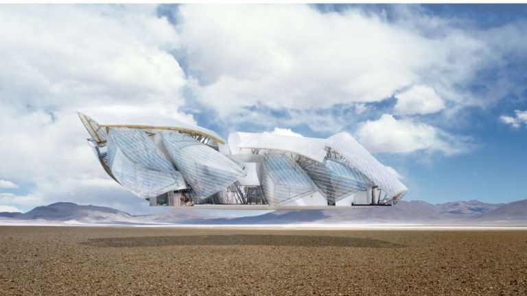
The Fondation Louis Vuitton sits proudly in the middle the Bois de Boulogne in Paris, a self-proclaimed icon of 21st century architecture. Here's how LVMH would have you see it:


Now, i'm not going to spoil the fun straight away, the building does have a really nice water fountain.


And provides for some pretty good engineering-textbook-front-page-photos.


So there's an okay view from the approach, although it's hard to gain an appreciation for the overall vision.


See the actual building there, peeking below though it's expansive quilt? 

But what Frank Gehry + CAD Monkeys LLP have forgotten in their grand plan is the rather significant forest that faces the site.


So, unlike Bilbao, a place that has unfortunately become synonymous with that misplaced piece of tinfoil, you can't stand back and look at the thing. What that means is the public are forced to appreciate the building like they would any other building, next to it and from ground level. So begins my study:


Frank Gehry, Master of the human scale.


(The building as it would be experienced day-to-day)


This building shows absolute disregard for his surrounding people and surrounding area. Is this Building a spectacle? a sculpture? an expression? an advert? This might be the worst style of architecture possible. Most PoMo at least had a use. Gehry, Hadid and Libeskind are just scribbles for hire. Maybe some dreary, post-industial cities are desperate for an architectural boost (naming no names), but Paris? This building is a waste of perfectly good grass.

Well, At least we've got that text book to look forward to.