I have added some more stuff to my portfolio site recently, from my first semester of third year.
The GREGGS Jute bag was a reaction to a brief called 'Movable Feast' - “For a selected social scenario, improve the way people eat and drink when there is no table available” - was the brief we were given at the inception of the ‘Movable Feast’ project. Rather cheeky for one to submit a bag as a solution in a Product Design Engineering course, but it was a clean, marketable and environmentally conscious solution.
The project, interestingly, then required us to swap with someone else halfway. I received ‘Social Colours’, from my mate Duncan, a design which aims to make business buffets easier by providing a system of components which serve, and accommodate the eating of, buffet food. The product also aims to smooth out the networking process by using the colour of the plate as a signifier of business area.
The improvements I made to this concept include separation of the food and drink areas, lessening constraints on pod use and allowing for the use of wet food, with or without pods.
To kick off this semester, we were given a brief to design an architectural connection, a joint project (no pun intended) between PDE and the Architecture students. The ‘Y’ joint combines a modernist appreciation of long vertical and horizontal spaces, whilst reinventing the traditional ‘Y’ connection seen traditionally. During this project I gained the title of self-proclaimed workshop wiz.
Yes, eagle eyes, that is the Ulm school ;) sorry Max Bill!
Please find these projects on my portfolio page, or on my Coroflot.
At the moment we are working on a very interesting project with the local community, looking to redevelop the nearby Garnethill park. Another joint project with a different set of Architecture students, this has the added fun of being a live project, set by the council, and including a huge amount of community input and insight. There will be an exhibition in late May, or you can find some of us next week at the RIAS Festival of Architecture in Dundee on the 24th March.
tom lever blog
18 March 2016
11 March 2016
Paris II
http://www.ricardobofill.com/EN/683/architecture/portfolio/les-espaces-d-abraxas-html
Les espaces d'abraxas was constructed in 1982 as the landmark building of the new town of Marne-la Valée, in the easternmost part of Paris. A 15 minute journey on the RER A from the centre of paris, it, and the surrounding area were proposed as a radical new plan for urbanism in paris, and part of a radical shift away from disappointing post-war building efforts.
As I've said elsewhere, Postmodernism was an movement, which began materially in the late 70's to react to the grey, meaningless and intimidating spaces that modernism, and the associated brutalism, had created in the years from after the war. Marne-la Valée must be one of the most significant and large developments to happen as part of this movement, so I took the opportunity to take it in on my recent trip to Paris.
I had heard things both positive and negative about this place, but most prominent in my mind was a scathing report in Deyan Sufic's 100 mile city. I will take you on a photographic journey through this experience.
One is greeted, when getting off the train, with this staircase as an initial impression of the area. So begins the theme of happy colors.
You are taken to a large public square, habited mainly by noisy French children making what they can of the flat concrete space. Punctuation of this space with architectural 'events' such as above are very frequent, but they seem to have lost their velour in the 30 years since construction.
The heavily applied feature colors and the gabled roofs are what separate this developments from the angry, rough lines of brutalism.
Coming off the square, one finds a vague and puzzling selection of very large commercial modern buildings. I went on a Saturday, so this entire surrounding fringe was completely empty.
Besides the odd friendly Careffour trolly that is. I was puzzled to see these littered around the area.
Approaching the main event, Les Espaces D'Abraxis, we come across this rather large and monumental 'traffic solution'.
I take these views in, on foot, safe in the knowledge that the urban planner didn't give one cent for pedestrian access.
And there she is. The first thing to hit you is the scale (16 storeys?), then the complex staggering of forms, and only then do you recognise the references to classical architecture. The most powerful feeling is a sense of awe. The negative kind.
This is the main vestibule, with walls the size of most Paris buildings, encroaching on a thin channel between the two main residential slabs. The man provides appropriate scale. Above this channel, you see many crisscrossing walkways and blocks, which give the space this abhorrent mixture of proportions.
As I continued to experience this space, a feeling of dread increasingly grew over me. The surprisingly small number of residents I spotted gave me suspicious looks, understandably, they probably get too many aspiring photographers intruding on their place. But this brutal cacophony of shapes made me feel really uneasy.
As an example of ridiculous application of scale, first see our man, zoomed in, and his surrounding space.
I approach my way out, leaving by a different route, somewhere through there? I also have found my explination for the shopping trolley. A Careffour supermarket lies just beyond this lump of concrete, and the residents find it easier to take their shopping direct to their door and abandon it.
And this is our way out. Yep, this, from my observations seems to be the primary pedestrian route in and out of Les Espaces D'abraxas. Ricardo Biofill's vision of appropriate public space hasn't stretched very far if I have to make my daily commute through a 50 meter multi-storey carpark.
Dread was my primary emotion in this aesthetic experience. It would be perhaps be more rigorous of me to do more than affirm my pre-existing beliefs about a space, but I can't find another way round. The witty use of classical elements seemed so coarse in combination with which I can now confirm to be very small and awkward flats. It is all built at such a ridiculous scale as well. In good architecture, your eyes wander around the space, hunting for detail. With this over-saturation of 'detail', I found my eyes looking for a way out.
It's so frustrating to think that this was completed mid-80's. It's basically contemporary. It is already crumbling, access is awful, and the space and the appearance themselves have a reputation among dystopian filmmakers. If one is to challenge the grey, meaningless and intimidating building of the mid-century, then one could do better than to produce something colourful, meaningless and intimidating.
27 February 2016
Paris I
I have just been on a trip with the PDE department to the grand city of Paris. Nowhere else have I been where I have experienced such a clear juxtaposition of the traditional, the modern, and the postmodern.
I begin the tour by setting the stage in the centre of Paris. Paris has a massive central district. But the whole centre, which must span 12 miles in diameter, is kept strictly to a consistent building height, around 5 storeys is the norm. The streets here are often tight, but buzz with a really clear energy. The road network, seemingly based solely on providing views of the Arc de Triomphe, opens up loads of diagonal routes and 'V' shaped junctions, which provide plenty of opportunity for local community centres and clusters around small squares.
This is best illustrated with the obligatory Arc De Triomphe panorama. Open it and zoom around, that's miles and miles of well proportioned streetscape. It's all around Paris. A feat of urban planning. Turn 180 degrees and...
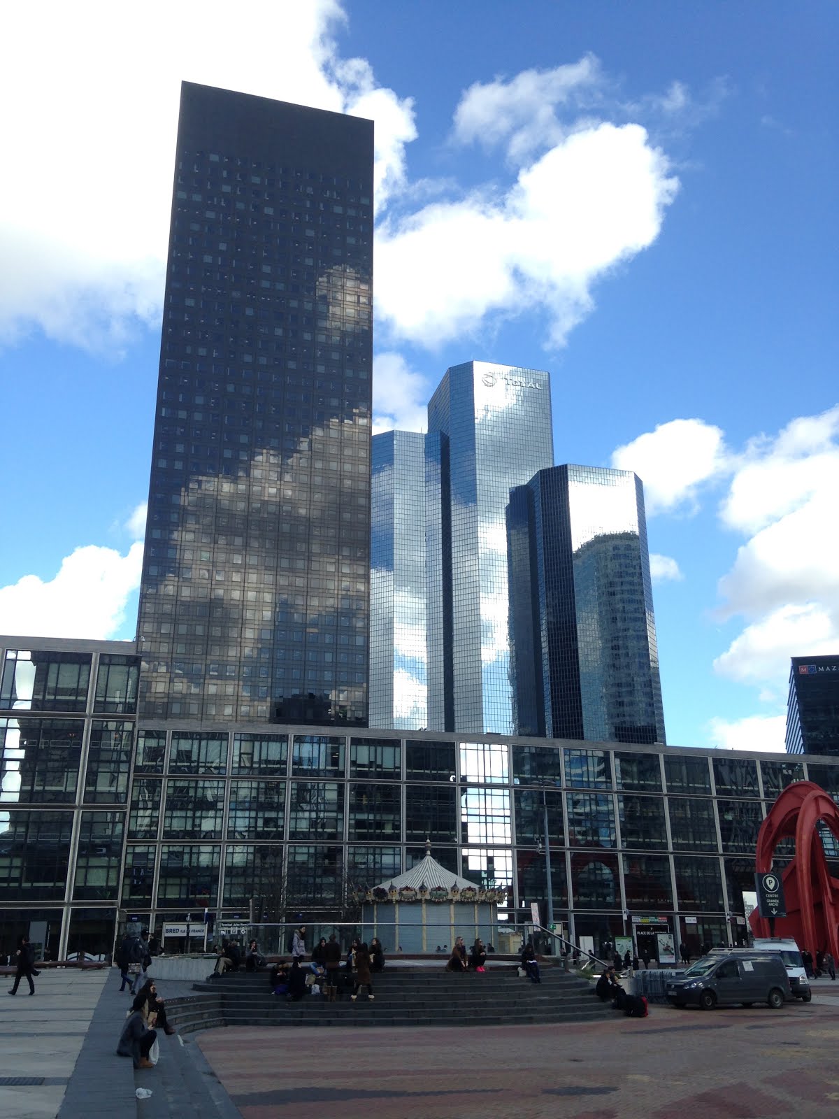
Oops. What's that? That's La Défense.
Europe's finest display of late 20th century architectural dick measuring, La Defense presses upon the heavy border of central Paris, a collection of meaningless skyscrapers and anonymous retail opportunity.
The problems with La Defense are threefold.
Firstly, here it is from the ground.
You could be anywhere. The place represents the worst of the effects of the 'international style'. Where paris has energy and character, La Defense has vague 'art' and plate glass. The central avenue, which, on it's own is a relatively decent public space is surrounded by a selection of shops such as Marks and Spencer, McDonalds and New Look. The only thing that places this in France is the vague association with the brands on skyscrapers such as 'EDF'.
Secondly, let's try to walk there.
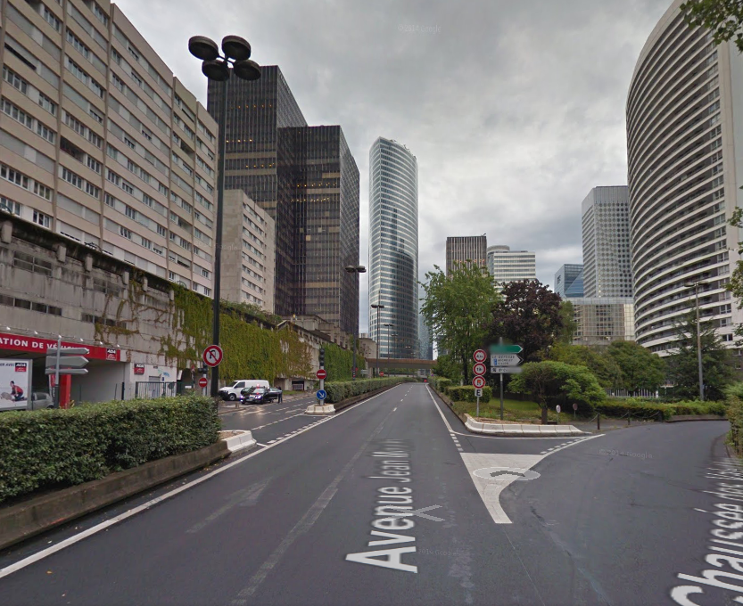
Easy, right? Well, No. That lovely 8min, 550m walk is not as it seems. If you'll forgive my use of google street view;
You'll see that the recommended route is a lovely avenue, for cars that is. The actual route:
Involves several changes of grade, a walk through a massive shopping centre, a mandatory coat and bag search, and is a headless hunt for the next signpost. It takes closer to 20 minutes. Why a new development should be so horrendous at accommodating for people on foot is beyond me.
But this high density development is all a necessary consequence of commercial success isn't it? I wouldn't say so, there is no reason planners couldn't have enforced mandatory pedestrian compatibility and a 10 floor height limit. What for land values though? Well ignoring the fact that the place was basically valueless 50 years ago, if you take a walk 600m in any direction from La Defense, you will find scores of three storey family homes. Hardly Manhattan is it?
Which brings me to my final point. A brief check on Wikipedia tells me that La Defense accommodates 180,000 daily workers. How many people live in La Defense? 20,000.
Leon Krier can be my crutch for this argument.
Seeing as no one actually wants to live in high rise buildings, building commercial buildings at this height in small zones necessarily creates large patches of suburban sprawl. This is what the americans have found. I think that Paris would have been better placed to expand it's well proportioned scale further as demand for building increased, perhaps integrate the 'horizontal skyscraper', and the odd monument like tour montparnesse doesn't do major harm. But our generation must learn from these 20th century mistakes and build cities that relate to humans and environments in the future.
I begin the tour by setting the stage in the centre of Paris. Paris has a massive central district. But the whole centre, which must span 12 miles in diameter, is kept strictly to a consistent building height, around 5 storeys is the norm. The streets here are often tight, but buzz with a really clear energy. The road network, seemingly based solely on providing views of the Arc de Triomphe, opens up loads of diagonal routes and 'V' shaped junctions, which provide plenty of opportunity for local community centres and clusters around small squares.
This is best illustrated with the obligatory Arc De Triomphe panorama. Open it and zoom around, that's miles and miles of well proportioned streetscape. It's all around Paris. A feat of urban planning. Turn 180 degrees and...
Oops. What's that? That's La Défense.
Europe's finest display of late 20th century architectural dick measuring, La Defense presses upon the heavy border of central Paris, a collection of meaningless skyscrapers and anonymous retail opportunity.
The problems with La Defense are threefold.
Firstly, here it is from the ground.
You could be anywhere. The place represents the worst of the effects of the 'international style'. Where paris has energy and character, La Defense has vague 'art' and plate glass. The central avenue, which, on it's own is a relatively decent public space is surrounded by a selection of shops such as Marks and Spencer, McDonalds and New Look. The only thing that places this in France is the vague association with the brands on skyscrapers such as 'EDF'.
Secondly, let's try to walk there.
Easy, right? Well, No. That lovely 8min, 550m walk is not as it seems. If you'll forgive my use of google street view;
You'll see that the recommended route is a lovely avenue, for cars that is. The actual route:
Involves several changes of grade, a walk through a massive shopping centre, a mandatory coat and bag search, and is a headless hunt for the next signpost. It takes closer to 20 minutes. Why a new development should be so horrendous at accommodating for people on foot is beyond me.
But this high density development is all a necessary consequence of commercial success isn't it? I wouldn't say so, there is no reason planners couldn't have enforced mandatory pedestrian compatibility and a 10 floor height limit. What for land values though? Well ignoring the fact that the place was basically valueless 50 years ago, if you take a walk 600m in any direction from La Defense, you will find scores of three storey family homes. Hardly Manhattan is it?
Which brings me to my final point. A brief check on Wikipedia tells me that La Defense accommodates 180,000 daily workers. How many people live in La Defense? 20,000.
Leon Krier can be my crutch for this argument.
https://fishtown.us/sites/fishtown.us/files/Arch.jpg
Seeing as no one actually wants to live in high rise buildings, building commercial buildings at this height in small zones necessarily creates large patches of suburban sprawl. This is what the americans have found. I think that Paris would have been better placed to expand it's well proportioned scale further as demand for building increased, perhaps integrate the 'horizontal skyscraper', and the odd monument like tour montparnesse doesn't do major harm. But our generation must learn from these 20th century mistakes and build cities that relate to humans and environments in the future.
Cartoons by Leon Krier, used without permission.
05 February 2016
Drawing Cars
I've said what i've said about car design, and those views would obviously suggest I want cars to be plainer, more rational, and more honest. But when I sit down and draw a car, as I do out of habit at least 5 times a day, it ends up looking something like this:
A journey though a nearby folder takes me to all these random drawings, which took on average about 20 seconds each-
Here's a recent one - it's a casual re-fresh of audi's visual identity -
There seems to be a consistent, and rather surprising (if you've been redding this blog) observation - it's all very expressive. This brings up some very pressing questions. Most importantly, Why?
I've been drawing cars at various degrees of competency for a vary, very long time, and what i've learned is a muscle memory technique for drawing various views of cars, very quickly. Why are they all so 'expressive' the answer is because that's what's fun to draw.
Car designers are in a weird and specific sector of design, where they are separated from the kind of rational or sociological thought that is required of an industrial designer, and there is a very serious culture of passion in the car industry.
So I find myself drawing cars in a particular, fun, expressive, passionate manner. But this is at odds with what I believe a consumer product should be. Something I find myself wondering is 'if this is what I draw, what I feel, then isn't that what should be delivered to the consumer?'. In a large way, this is the thought that drives the majority of car design today. Any hint at any form of restraint seems constricting and oppressive compared to this practice.
But no, despite what my hand and my elbow tell me, I don't buy these kind of 'expressive forms'. We have to understand that in the scheme of things , a specific kind of crease on the side of a car has no positive effect whatsoever. It doesn't give the petrolhead any extra performance; the traditional looking Audi A6 has the exact same drag coefficient as it's swoopy, 'aerodynamic' sibling, the A7.
I'm not sure wether i'm mad at the grotesqueness in the car industry because I now believe myself 'a designer', or if i'm just a disappointed potential consumer; The car industry is struggling to give people my age a reason to buy anything! But I think it's clear that , with respect to car design that is actually respected long term, form does and should follow function.
Think of any of the 'classics' (those that actually sold in volume that is) the Mini, the Beetle, the (now retired) Land Rover, the 500, the Porsche 911, the Golf, citroen 2CV. What primarily defines these cars is, over all, restraint, sincerity and functionalism. The climate today is moving more and more towards fads and fashion, including the VAG group. I wonder if the car market will ever produce a high volume, long run production car ever again.
A journey though a nearby folder takes me to all these random drawings, which took on average about 20 seconds each-
Here's a recent one - it's a casual re-fresh of audi's visual identity -
There seems to be a consistent, and rather surprising (if you've been redding this blog) observation - it's all very expressive. This brings up some very pressing questions. Most importantly, Why?
I've been drawing cars at various degrees of competency for a vary, very long time, and what i've learned is a muscle memory technique for drawing various views of cars, very quickly. Why are they all so 'expressive' the answer is because that's what's fun to draw.
Car designers are in a weird and specific sector of design, where they are separated from the kind of rational or sociological thought that is required of an industrial designer, and there is a very serious culture of passion in the car industry.
So I find myself drawing cars in a particular, fun, expressive, passionate manner. But this is at odds with what I believe a consumer product should be. Something I find myself wondering is 'if this is what I draw, what I feel, then isn't that what should be delivered to the consumer?'. In a large way, this is the thought that drives the majority of car design today. Any hint at any form of restraint seems constricting and oppressive compared to this practice.
But no, despite what my hand and my elbow tell me, I don't buy these kind of 'expressive forms'. We have to understand that in the scheme of things , a specific kind of crease on the side of a car has no positive effect whatsoever. It doesn't give the petrolhead any extra performance; the traditional looking Audi A6 has the exact same drag coefficient as it's swoopy, 'aerodynamic' sibling, the A7.
I'm not sure wether i'm mad at the grotesqueness in the car industry because I now believe myself 'a designer', or if i'm just a disappointed potential consumer; The car industry is struggling to give people my age a reason to buy anything! But I think it's clear that , with respect to car design that is actually respected long term, form does and should follow function.
Think of any of the 'classics' (those that actually sold in volume that is) the Mini, the Beetle, the (now retired) Land Rover, the 500, the Porsche 911, the Golf, citroen 2CV. What primarily defines these cars is, over all, restraint, sincerity and functionalism. The climate today is moving more and more towards fads and fashion, including the VAG group. I wonder if the car market will ever produce a high volume, long run production car ever again.
21 January 2016
06 January 2016
Functional
Mies Van Der Rohe didn't design Glasgow University,
But if he did, it would probably be the most functional university in the world.
03 January 2016
West End
A look at new buildings in Glasgow's west end.
As we are bombarded with the news of dramatic new developments across the world, we hear from Glasgow news of the new Reid building at the School of Art, of the Riverside Museum by Zaha Hadid, and the other various neo-futuristic buildings that spring up on the Clydeside. There is another current in the design of the city that remains unreported.
The west end of Glasgow is awash with 4 storey victorian tenement buildings, all of very slightly different styles and heights, but all with the same basic concept. High ceilings, short roofs, shops at the bottoms, and a single shared stairway between the 8 or so flats within the building.
What we are seeing is a new generation of buildings which are forced to play nicely with the surrounding cityscape, but have different objectives.
This building, on Great Western Road, maintains the roofline of the historic road, while managing to cram in a whole seven stories, where the adjacent buildings manage only four. The glass roof has a cunning way of disappearing into the surrounding (grey) sky. It also highlights the differences in internal roof heights between now and victorian times.
This building, tackier in it's overall makeup, does a similar thing, The smaller floor heights are more apparent, but it is also a more extreme example. Off camera, the blue portion of the building goes down a further two or three levels below the road level, cramming 10 floors onto the normal street scape. It achieves this with both a hidden top level, and by adding an extra floor on the corner face of the building, while connecting to the rest of the street at the regular level.
There is a building in partick with achieves this affect too. The raised corner is actually quite a 'dramatic' effect, which gives us exaggerated, drawing like proportions. Note, the building doesn't actually lose it's top floor away from the corner, it just hides it.
Here is a building which uses 'jumble' to cast our eyes away from the extra floors. Again with the objective of subtly building as much living space of property in the high demand area. We can actually see an extra three floors beyond the conventional roofline.
The new annex to the Glasgow University Gym uses all the familiar hallmarks of these new buildings, but as I was a personal witness to it's construction, I can reveal it's secrets. The typical tenement buildings are made of solid sandstone blocks, but this used the thinnest plates of stone, all hung on a concrete, steel and breeze block frame. Less sincere, but these production methods will be of much lower cost. Will they stand the test of time?
This school building takes the graphic imitation a step beyond the stone tiles. In form it mirrors the classic school building, but with a much funkier modenature. It has forgone bricks however, for coloured panels, which seems unjustly insincere.
So what of these secret skyscrapers? Initially I was put off by these buildings, seeing them as cynical and insincere, but when you look at the bigger picture, wether or not developers were forced to consider their surroundings or not, these new buildings are much more considered than modern buildings in neighbourhoods without any historical context to preserve. A wander five meters off the main roads reveals travesties such as this:
So I guess this is an admirable that these new buildings, some more than others, are respecting the ir context. The cramming in of extra floors is, I guess, an unavoidable consequence of the increase in land value within the city. Let's hope we can maintain this considered level of urban density in the future, and not devolve into meaningless plate glass skyscrapers.